Problem
This was a location-based app dealing with a trust problem. People found the idea interesting, but weren't interested in sharing their location. Without that, they couldn't use the app's full functionality, and kept uninstalling. We were losing the battle before we even got a fair chance to fight it.
Two fears sat underneath every install: that turning this on meant nearby strangers, not just friends, would now know where they were, and that even past that fear, there was no clear sense of what they'd get back for the exposure. Introverted users at public events, concerts, sporting events, wanted a way to connect with people around them without a physical approach, but the app asking for their location before it had proven anything to them was working against that want from the first screen.
Goals
We needed to earn our users' trust and increase activity. The app was designed for two personas, and we needed a safe experience for both.
- Increase location-based connectivity. Let users choose public sharing, connecting with strangers nearby, or private sharing with a chosen few, without either persona's comfort level overriding the other's.
- Increase real interaction. Once two people were connected, more interaction meant more perceived value in the app itself.
- Build trust deliberately. An immediate way to turn location sharing off, and an upfront walkthrough of what the app would do with it, so nobody felt surprised later and quit.
Two Personas, One App
These goals had to satisfy two different kinds of people sharing the same product:

18–24, students. Shares location publicly in malls, restaurants, movies, concerts. Wants to have fun, share activities, meet new people nearby.

Shares location with a close group of friends and family only. Wants to stay connected with people they already know.
Solution
The Onboarding to Create Trust
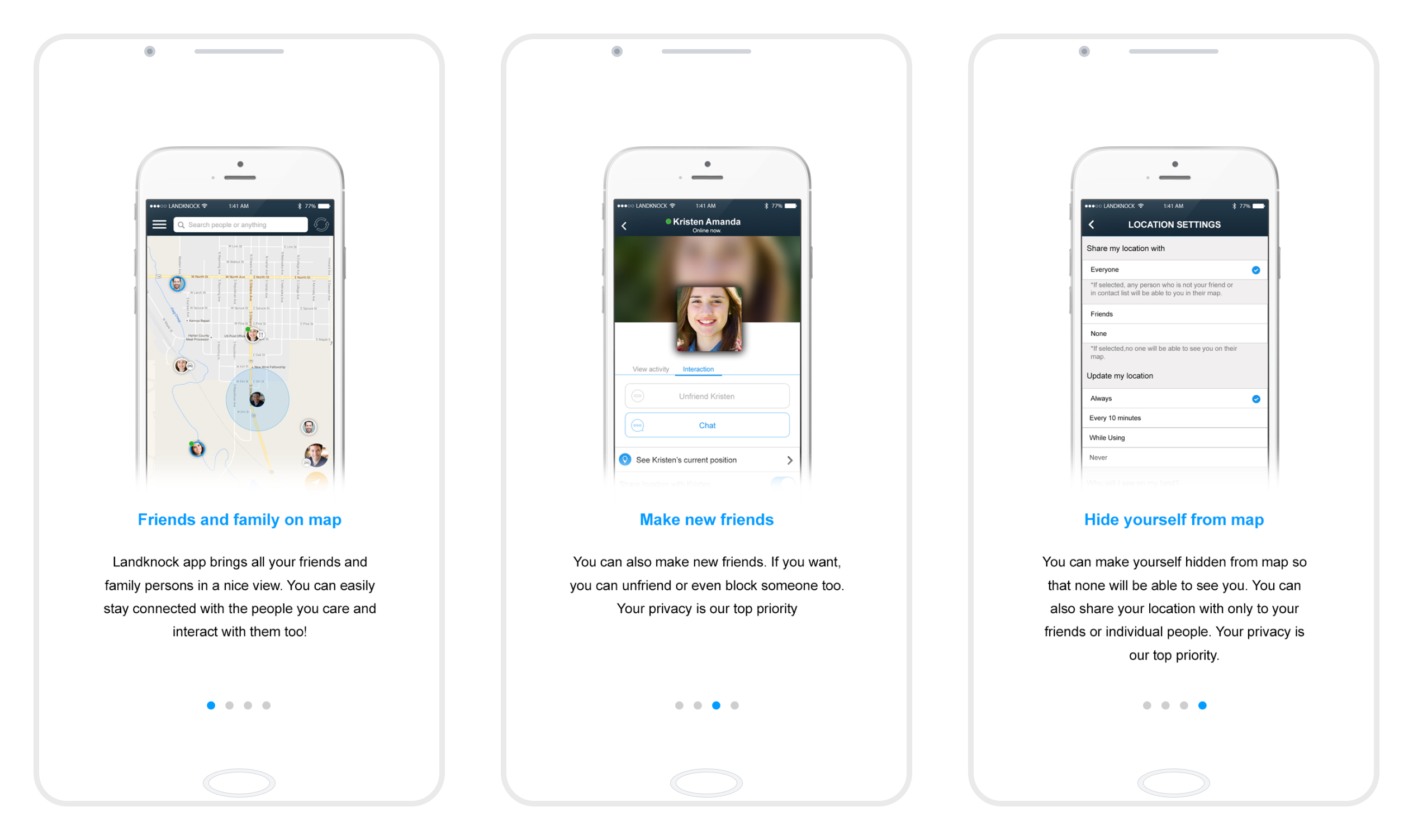
Instead of telling people the app was safe, I wanted them to feel it. Onboarding alone pushed signup completion from 30% up to close to 60%.
The Registration Flow
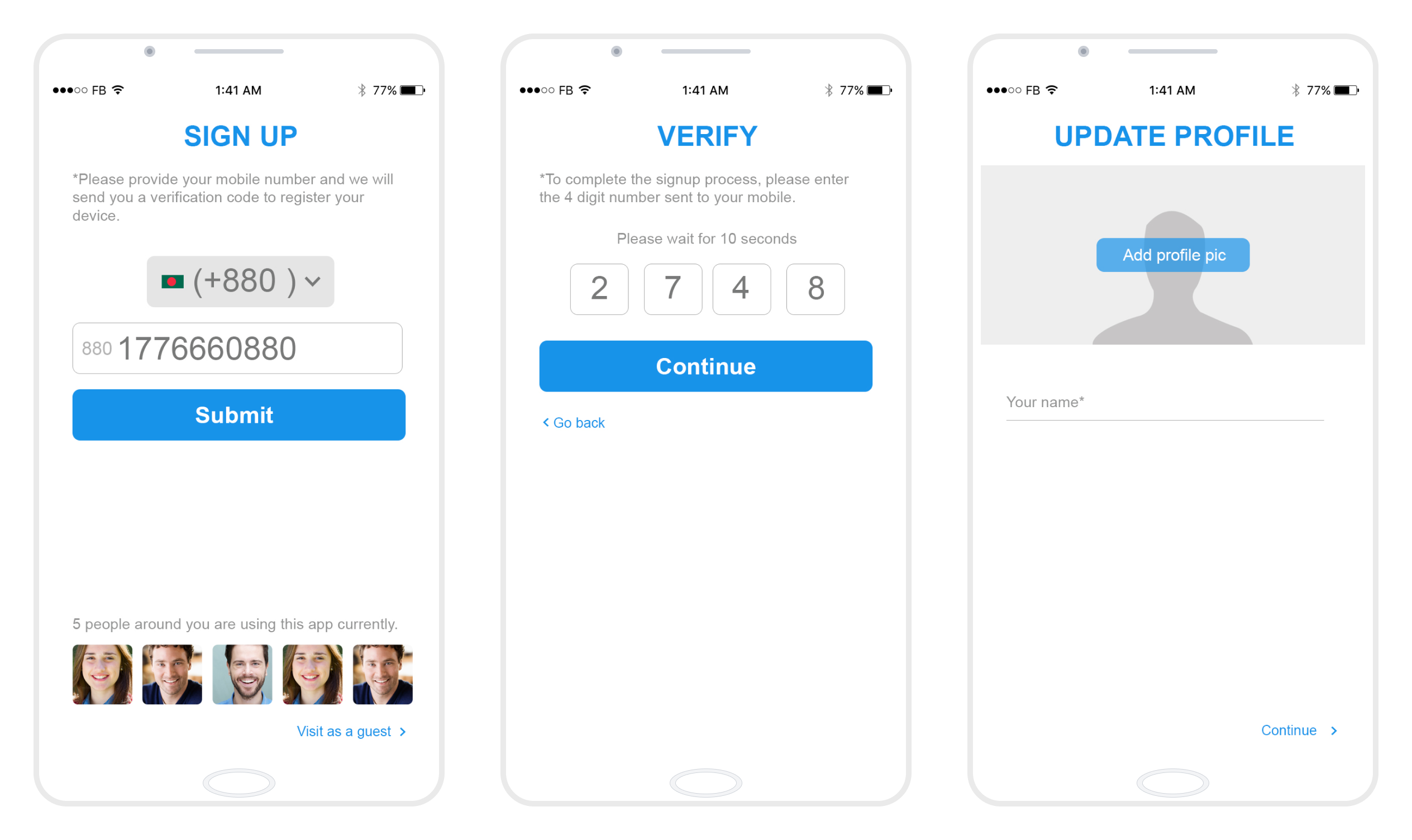
During brainstorming, we decided against email-based signup, login would happen only through a mobile number. Later, showing nearby active people on the signup screen gave an immediate jump in signups, especially for the Social Monkey persona.
Three Questions Before the Map
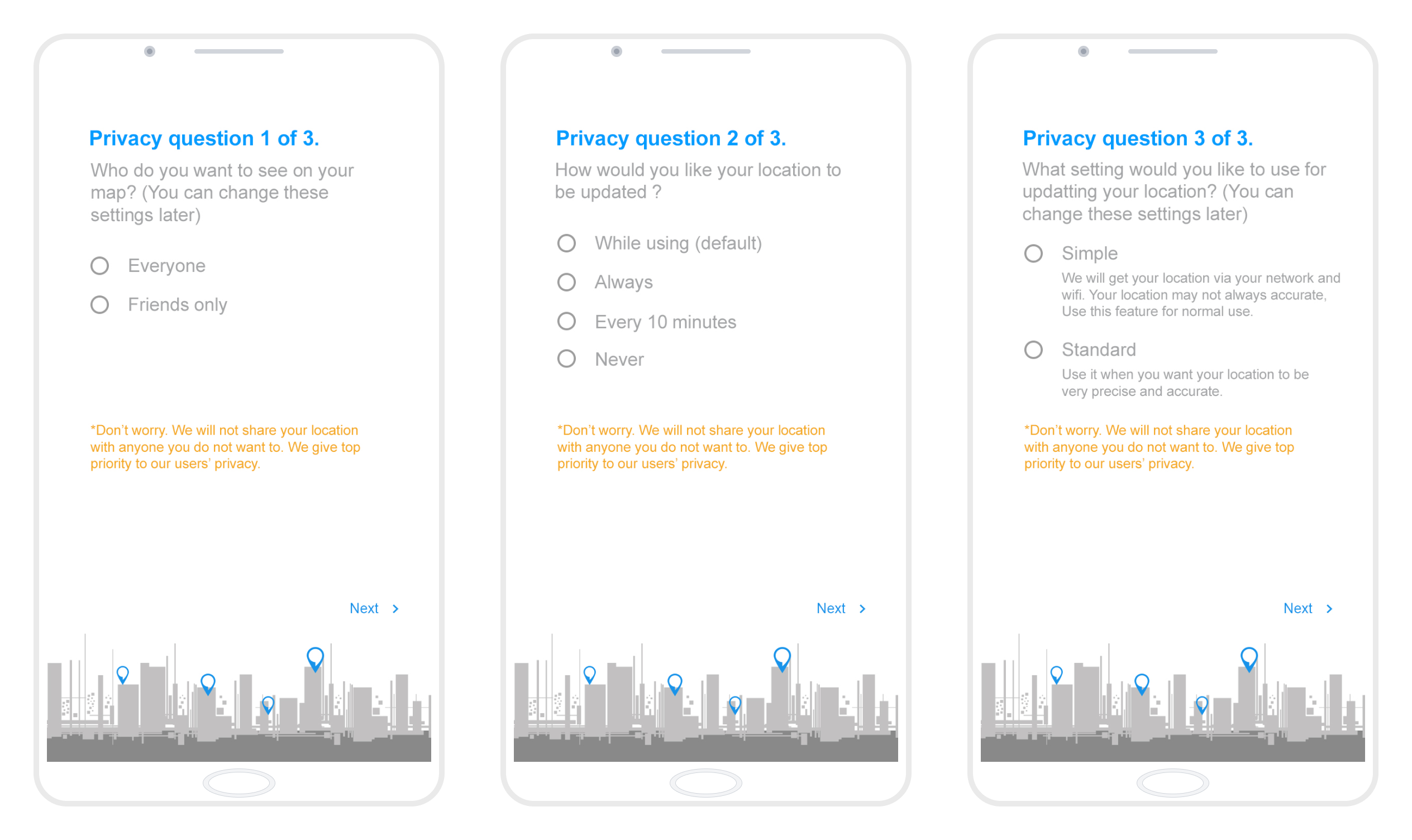
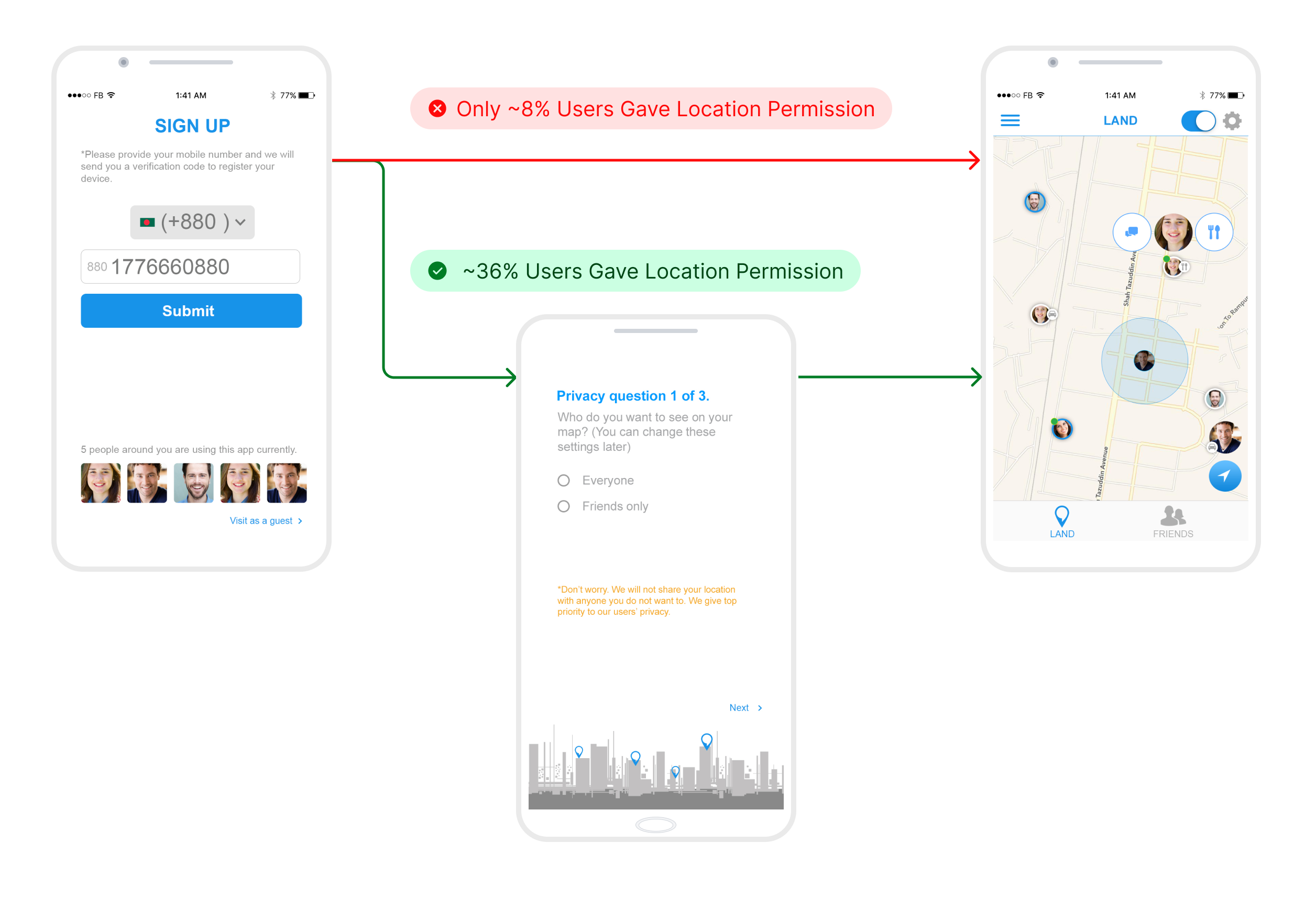
We hadn't shipped privacy questions at launch, so people signed up but hesitated to grant location access, then quietly left. Asking these questions right after signup, instead of hiding them in settings, lifted permission grants from 8% to 36%.
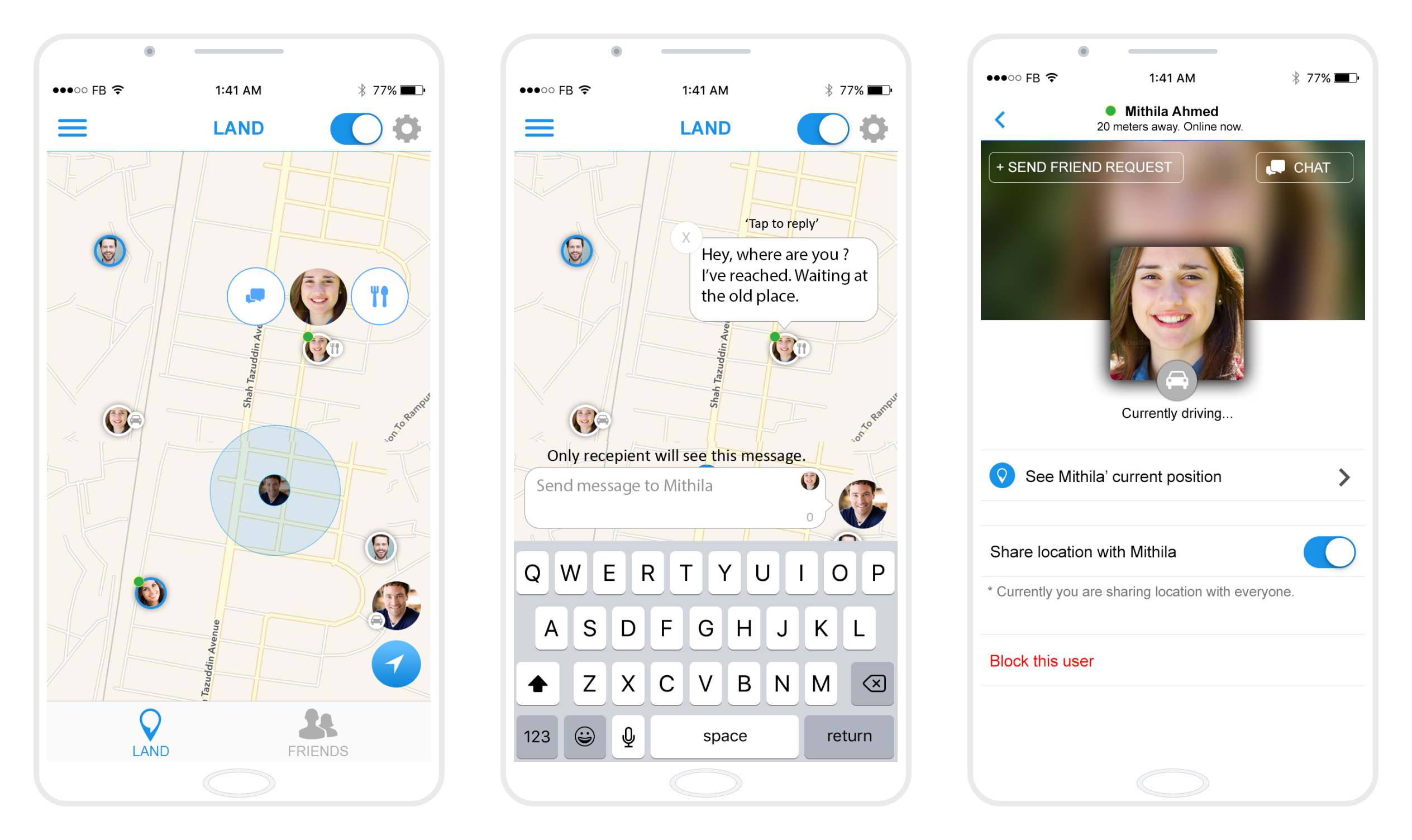
The Interactive On-Map Chat
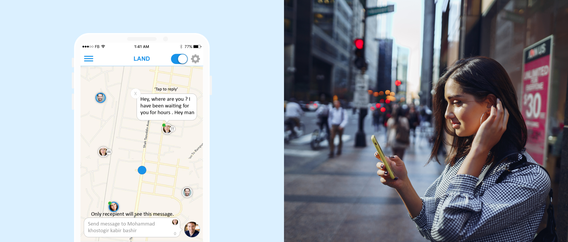
We noticed a sharp drop-off whenever people left the map to chat, it suddenly felt like just another chat app. So I designed an on-map chat instead, keeping people right where they were. Daily conversations jumped from about 100 to over 1,000.
The Screens Around the Map
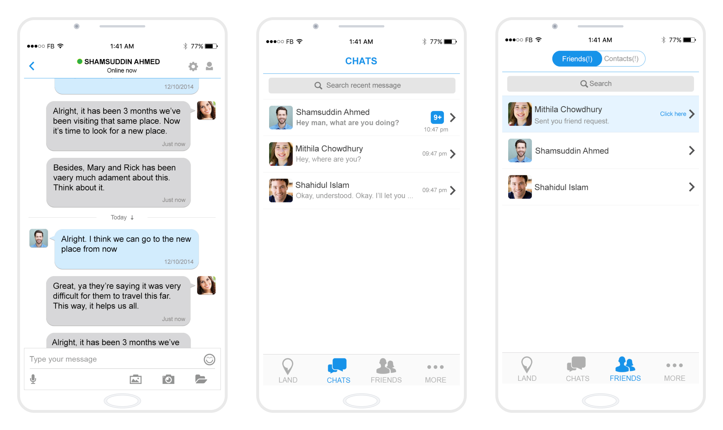
Longer conversations moved into a full thread, alongside a chats inbox and a friends list with pending requests, for whatever a quick bubble couldn't hold.
Results
Once trust was earned, people used the product more.
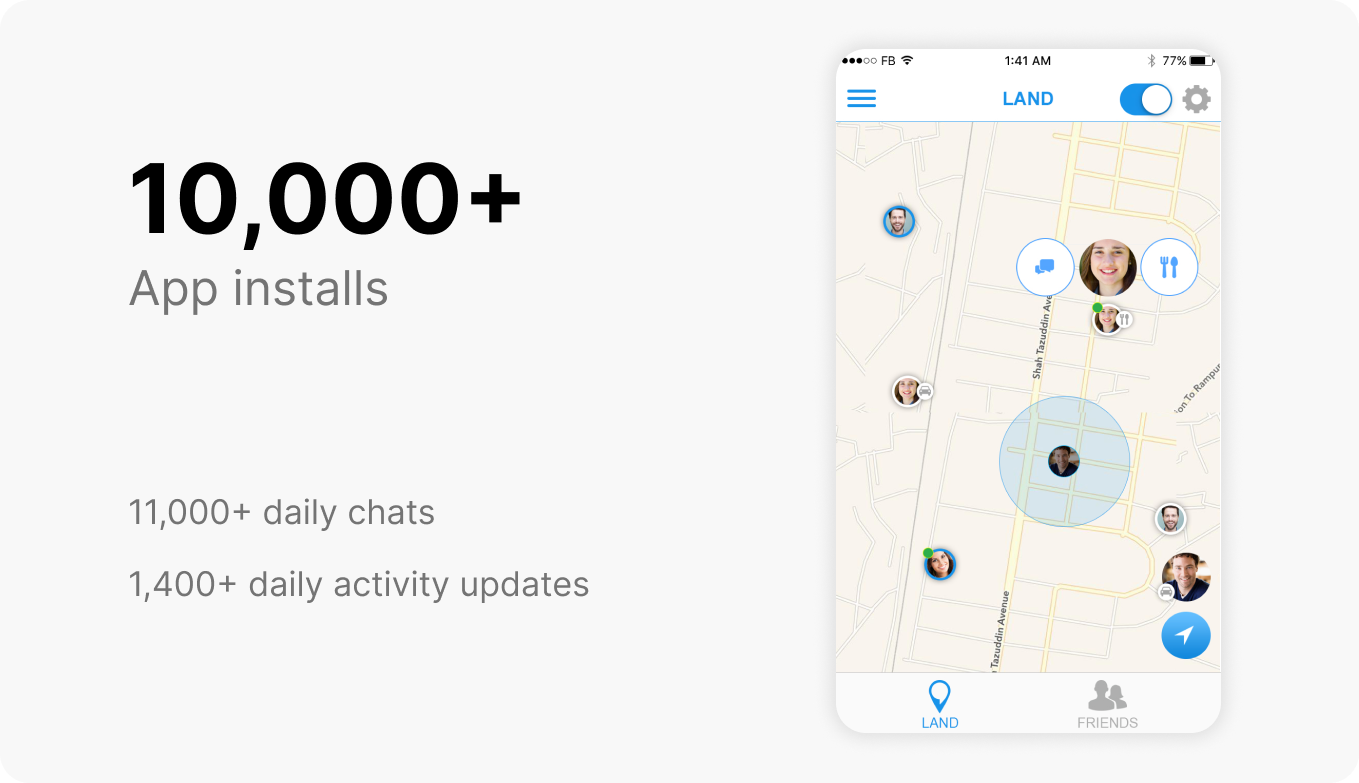
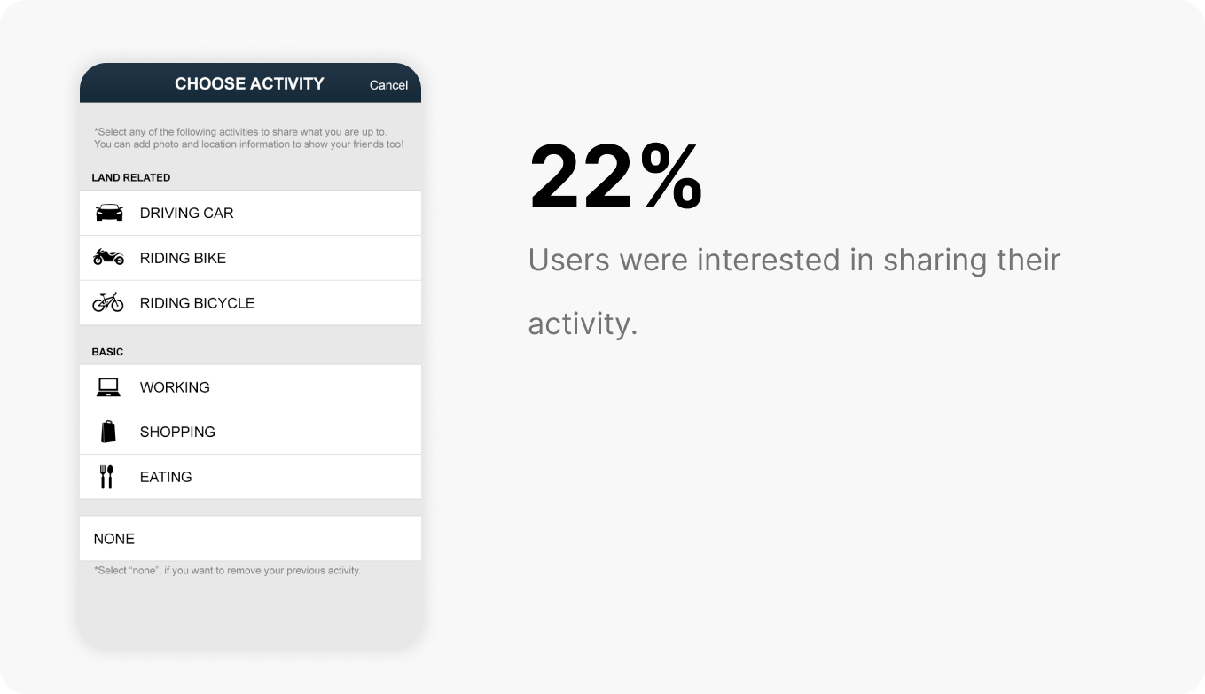
Signup rose from 6–7% to 60–70%, messages passed 1,000 a day, and 22% of users shared real-time activity. Even so, the project ended after 14 months on funding runway. I was also a co-founder, and with no monetization or investors, we had to let it go.
Ideation
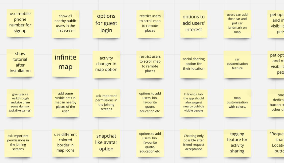
It looks organized here, but the actual process was messy.
Brainstorming
The team's raw feature ideas, on sticky notes, the material everything below was scored and narrowed from.
Our MVP Was a Prototype
The MVP was an interactive prototype built in InVision, a clickable walkthrough.
Research
Alongside the brainstorm and the prototype, two more inputs ran in parallel.
The Ad Survey
A Facebook ad campaign ran a short survey to the target audience, at a wider scale than one-on-one conversations could reach.
Competitive Analysis
Glympse had strong location-sharing but no chat. Life360 was colorful and location-focused but missing chat too. Snapchat wasn't location-first, but its map avatars and interactivity were already what people loved. Millions of users across all three confirmed the core idea, just not put together in one place yet.
Feature Prioritization
Our own brainstorming, the MVP, conversations with the target audience, and research gave us a clear sense of what to build and what not to.
We couldn't build every feature at once, so we prioritized.
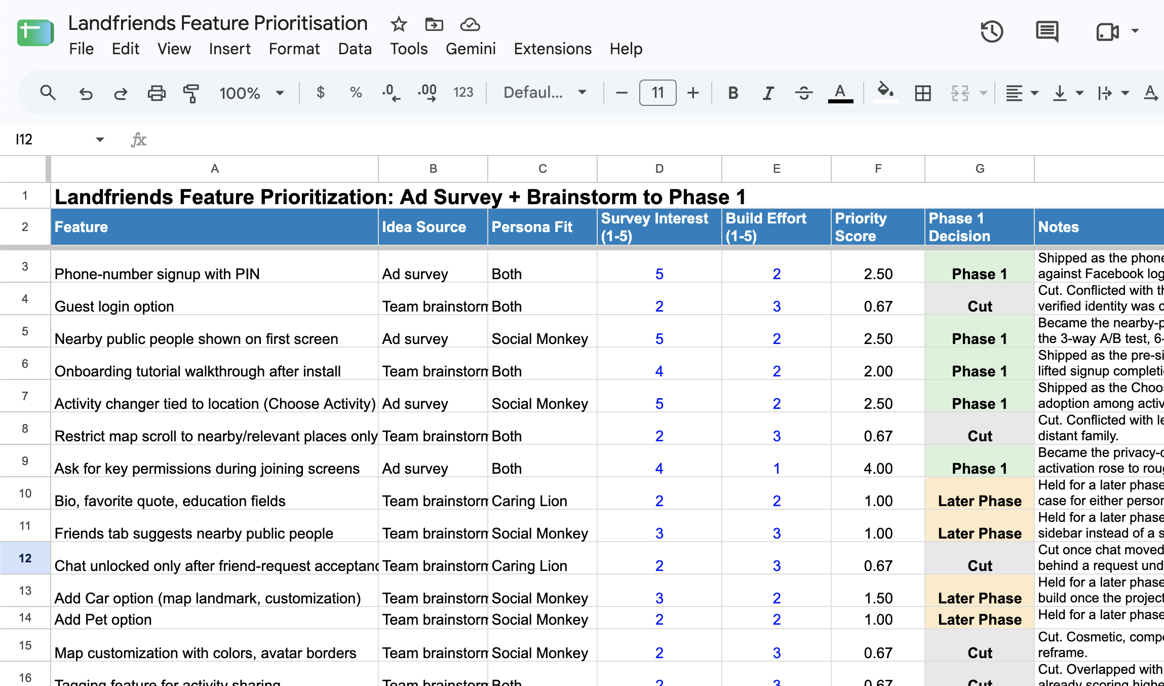
Full scoring sheet at landfriends-feature-prioritization.xlsx. Reconstructed to show the method, since the original 2017 board wasn't saved; scores are set to match what's documented as shipped, held, or cut elsewhere on this page, not a scan of the original.
Sketching & Wireframes
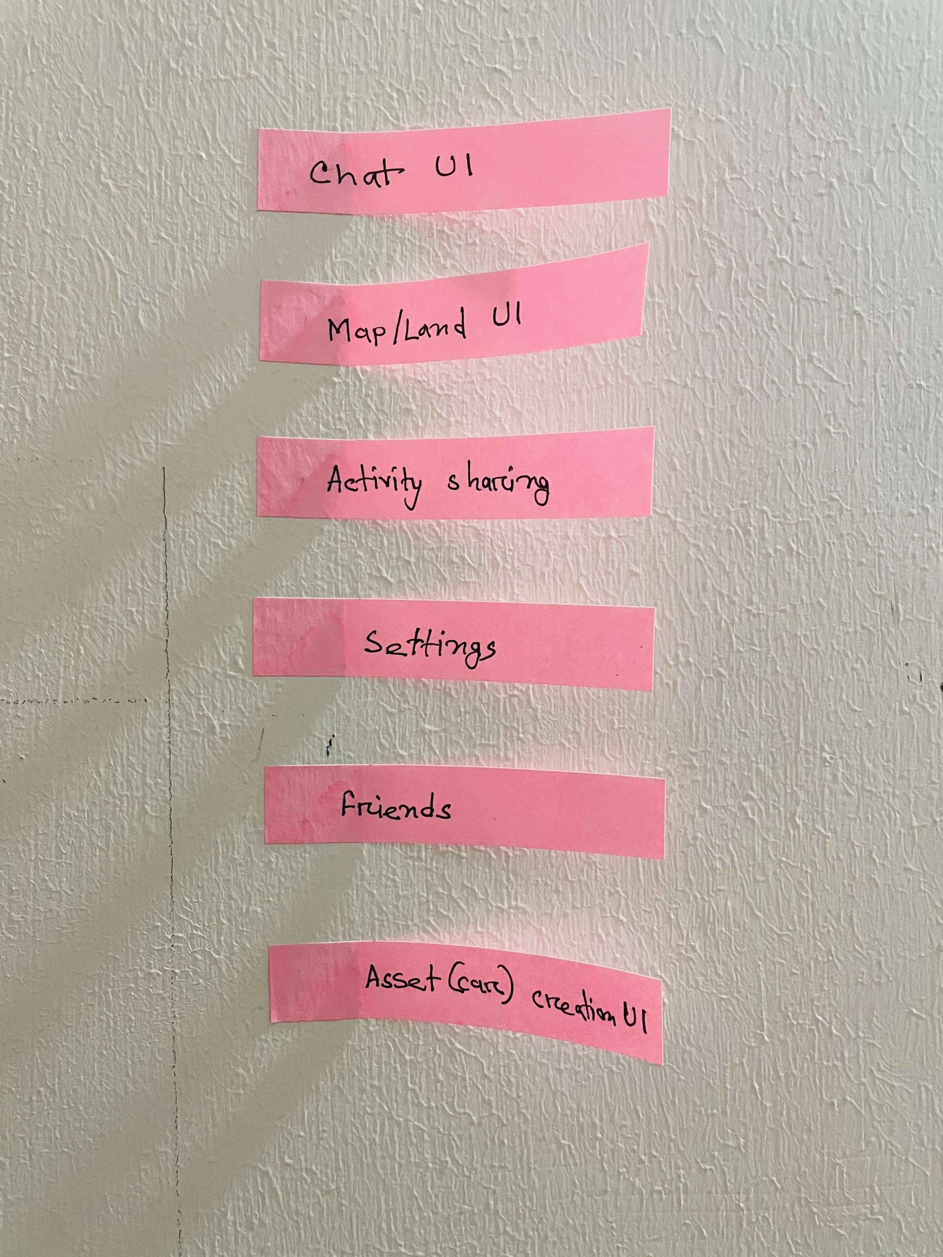
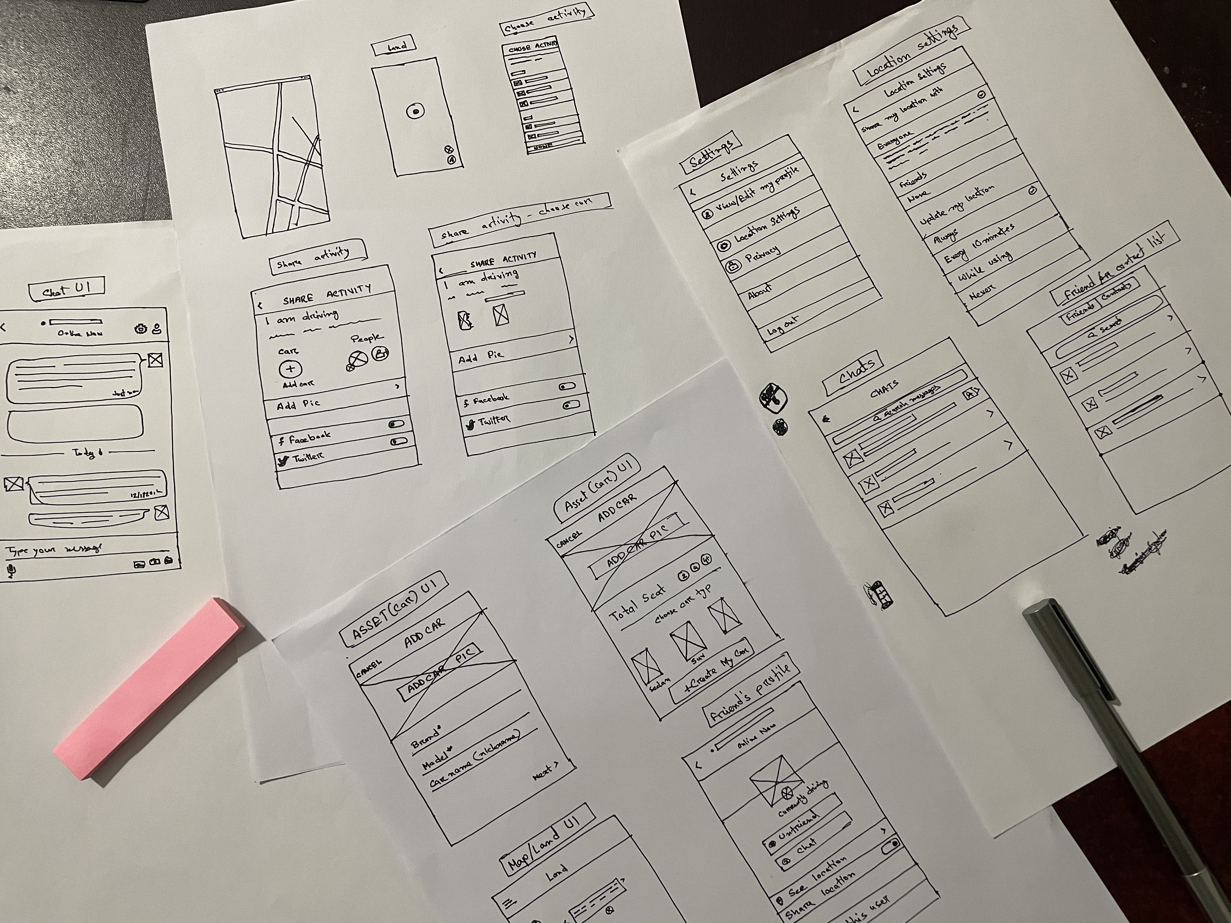
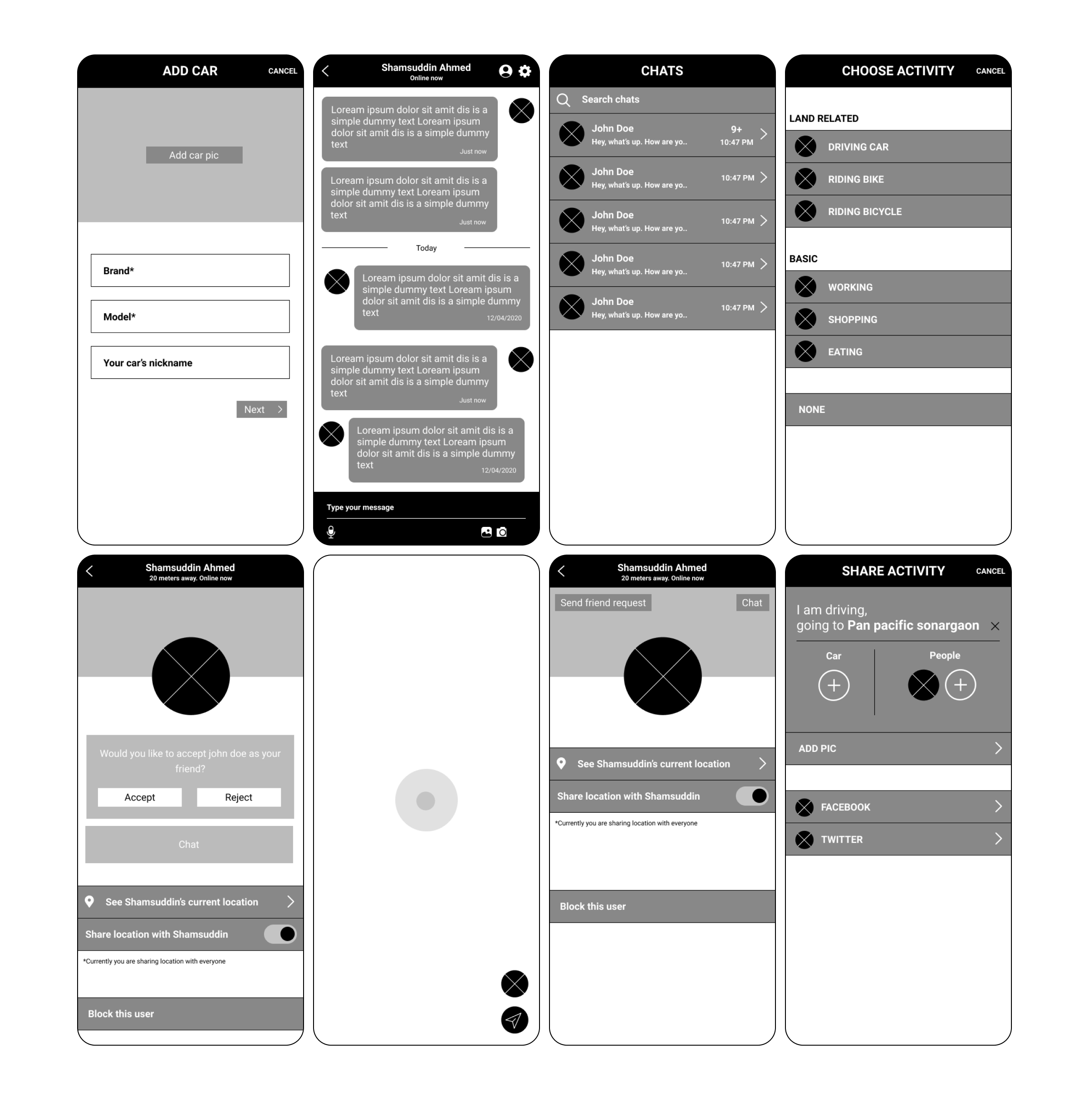
Once we finalized the features to work on, I started drawing on paper.
Over 12 user-flow iterations and 100+ sketch passes ran across different flows and screens before wireframing started.
After Launching, We Ran Into More Issues
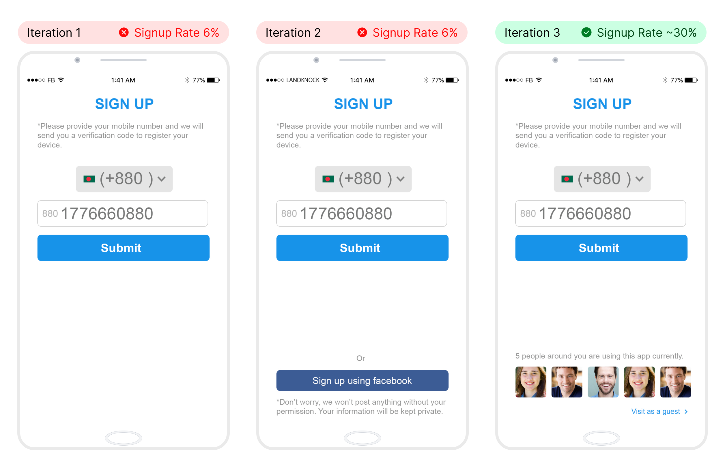
Issue 1: Only 6 Out of 100 Signed Up After Installing
I had no clue why people were installing but not signing up. We relaunched with a Facebook login option, thinking easier signup would help. It didn't. We relaunched again showing nearby people instead, and that worked, signup completion rose to about 30%.
Issue 2: Only 8% of Users Gave Location Permission
Very few of the people who signed up were granting location permission, most just quietly explored and churned. Interviews showed they didn't know they could control who saw their location. A short privacy flow after signup fixed that, permission jumped from 8% to 36%.
Issue 3: Retention
Retention Issue 1: Nobody Was Interacting With the Sidebar
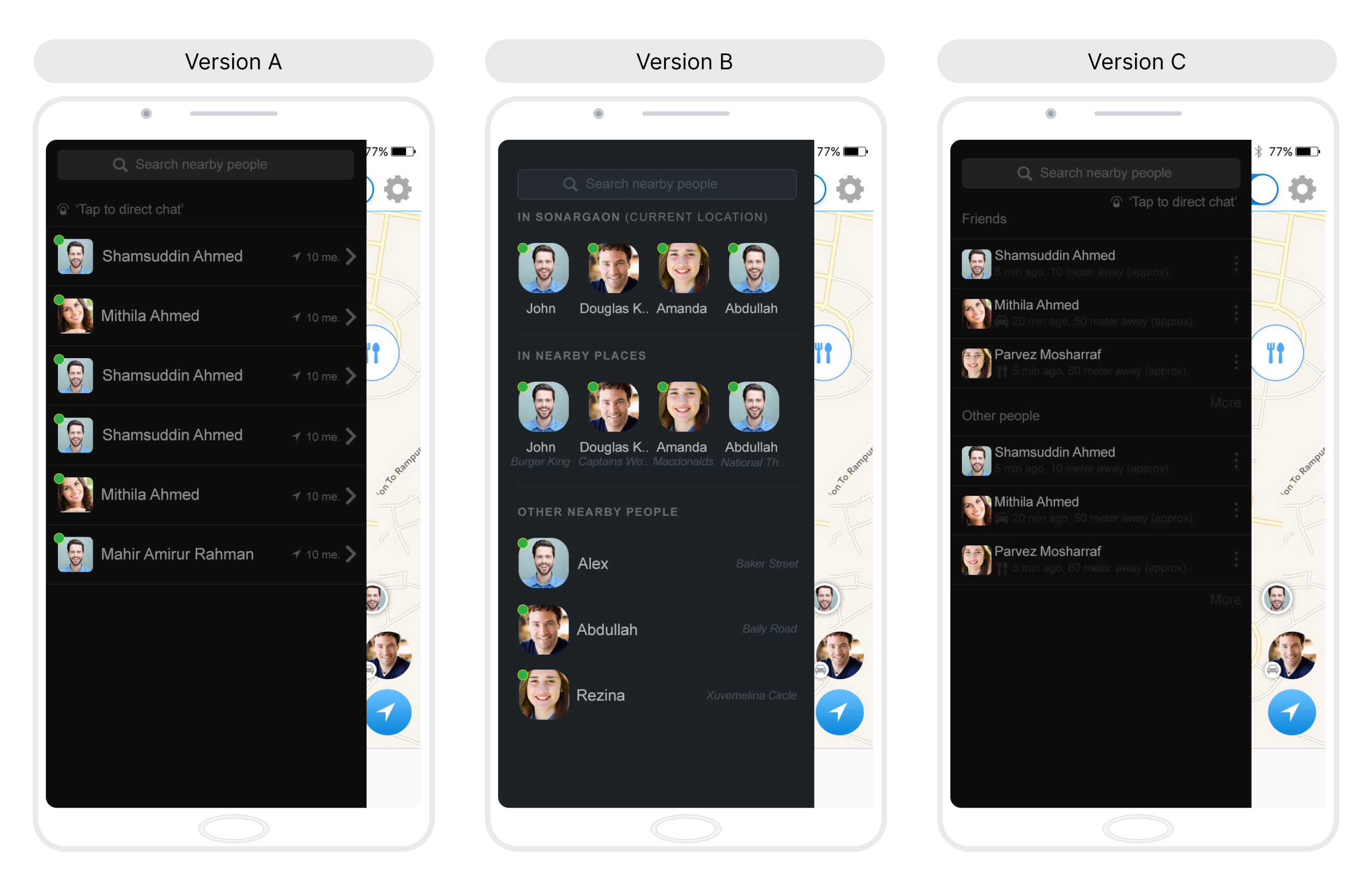
The sidebar showed a list of nearby people. Almost everyone opened it, but only about 2% ever tapped through to a profile. I redesigned it to make that next step more obvious.
Quick guess before you scroll: which version got more people clicking into someone's profile, A, B, or C?
Reveal the winner
Version C: about 12% clicked through to a profile, the clear winner.
Version A and Version B: roughly 2–3% each.
Retention Issue 2: Only 8% of Users Were Using the Chat Feature
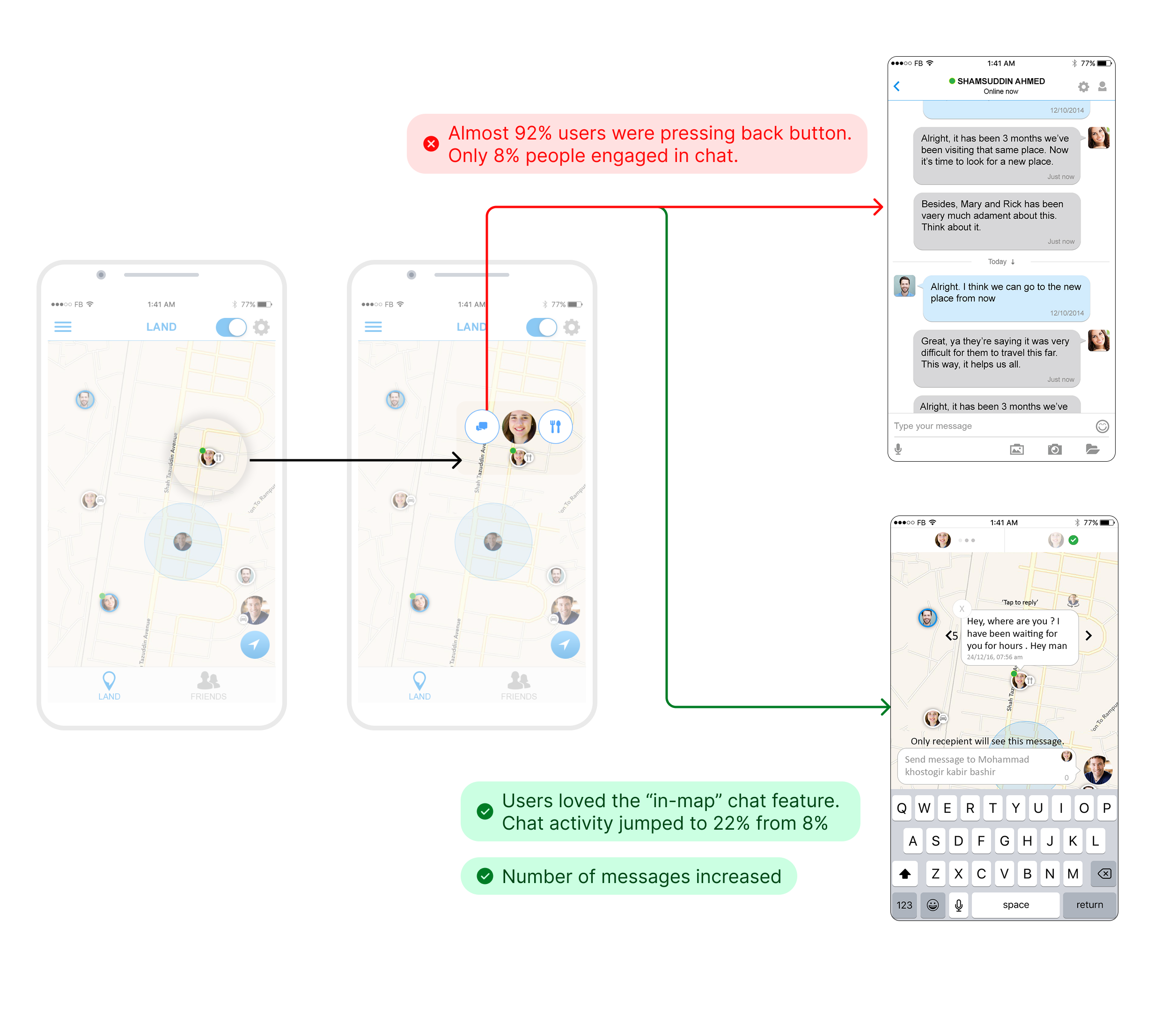
The chat feature mattered for retention, but almost nobody used it. Digging into behavior, I found people tapped the chat icon, landed on the inbox, and immediately hit back.
My team wanted to add more features to the chat UI. I pushed back, people came to this app for something closer to reality, scrolling the map and seeing friends nearby, so I designed an on-map chat instead of a separate inbox. We shipped it as small message bubbles above each person's avatar, right on the map, tapping one opened the conversation in place, keyboard included, with typing indicators and replies surfacing directly on the map. Almost no app had done this before. Chat engagement jumped from 8% to 22%, and daily messages went from about 100 to over 1,000.
The Flow, End to End
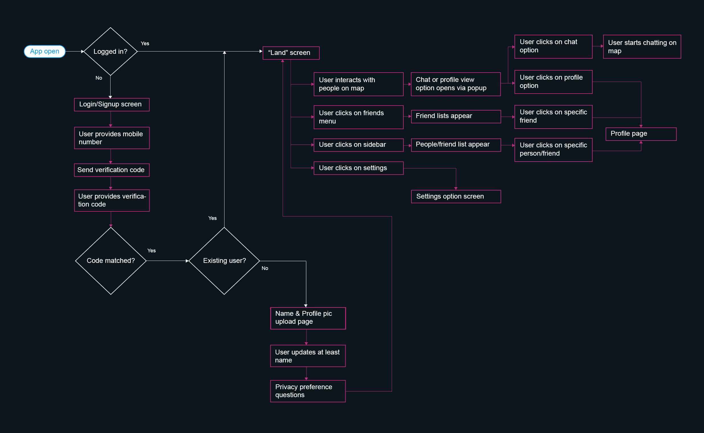
With signup, trust, and retention all fixed, this is the full path a user actually moved through, login to the map to everything reachable from it.
What This Taught Me
The lesson wasn't in any single screen.
This was the largest product I'd owned start to finish up to that point in my career, and it's the project that turned product design from one of several things I did into the thing I do. A good individual decision doesn't rescue a project without the process and discipline around it, testing consistently beat my own assumptions on this product, on the signup screen and again on the chat, and both times the instinct to add more lost to the instinct to strip down.
There are individual screens from this project I'd design differently with what I know now. That's a craft still developing, not a regret. What I'd keep doing exactly the same way: watch what people actually do with their thumb before trusting what they say they want, and be willing to ship the smaller, stranger version of an idea, chat bubbles on a map, nobody had done, before anyone confirmed it would work.
Runner-Up, National Mobile Application Award
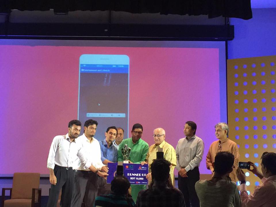
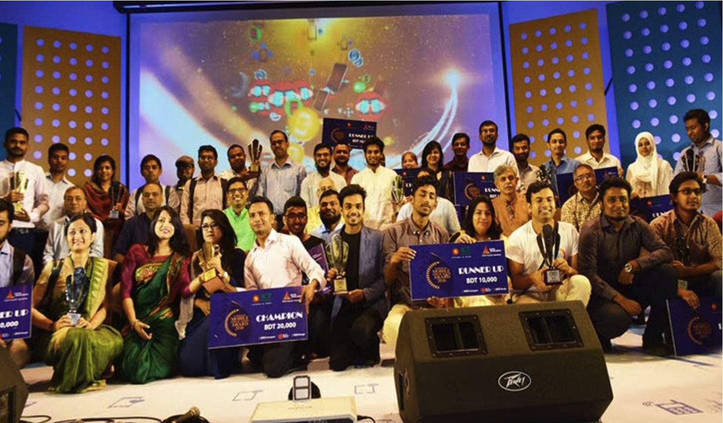
Landfriends was entered into the National Mobile Application Award 2017, organized by Bangladesh's ICT Division and Google Developer Group Bangla, and placed Runner-Up.
That instinct is the same one I still design with. It started here.