Problem
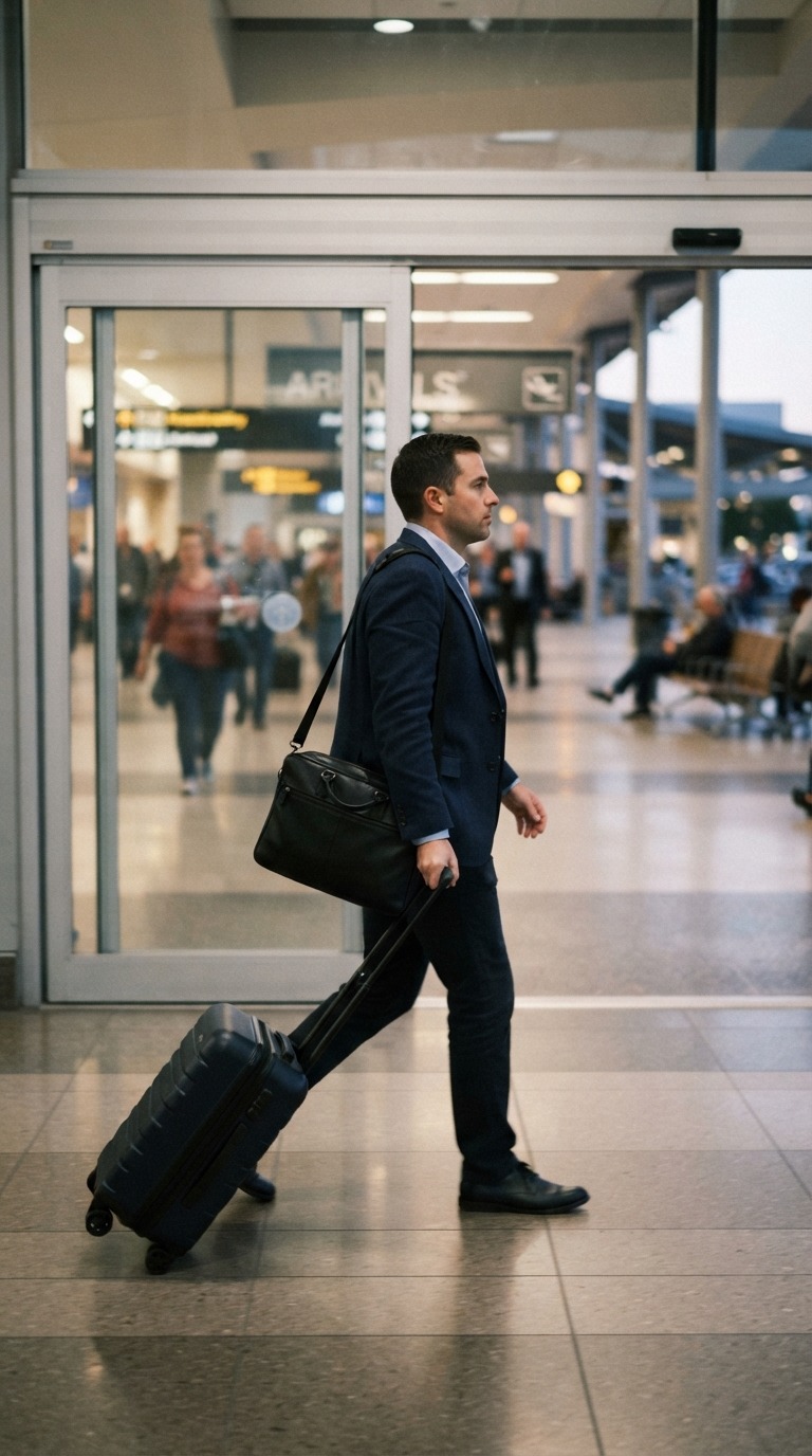
Professionals who travel for work land in a new city for a few days, too short to make friends. They spend it bored and lonely. Some want company, some a partner for that window. Few apps address this.
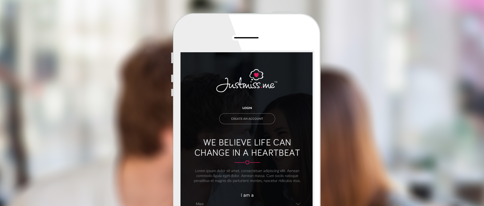
The product starts as a web portal, but a mobile app is planned. That meant designing for a thumb as well as a cursor, so touch interaction was a core part of the work from the start.
Goals
- 1Connect traveling professionals with other traveling professionals.
- 2Connect locals with traveling professionals.
- 3Make the mobile app highly interactive, with all the modern touch interactions.
Touch interactions
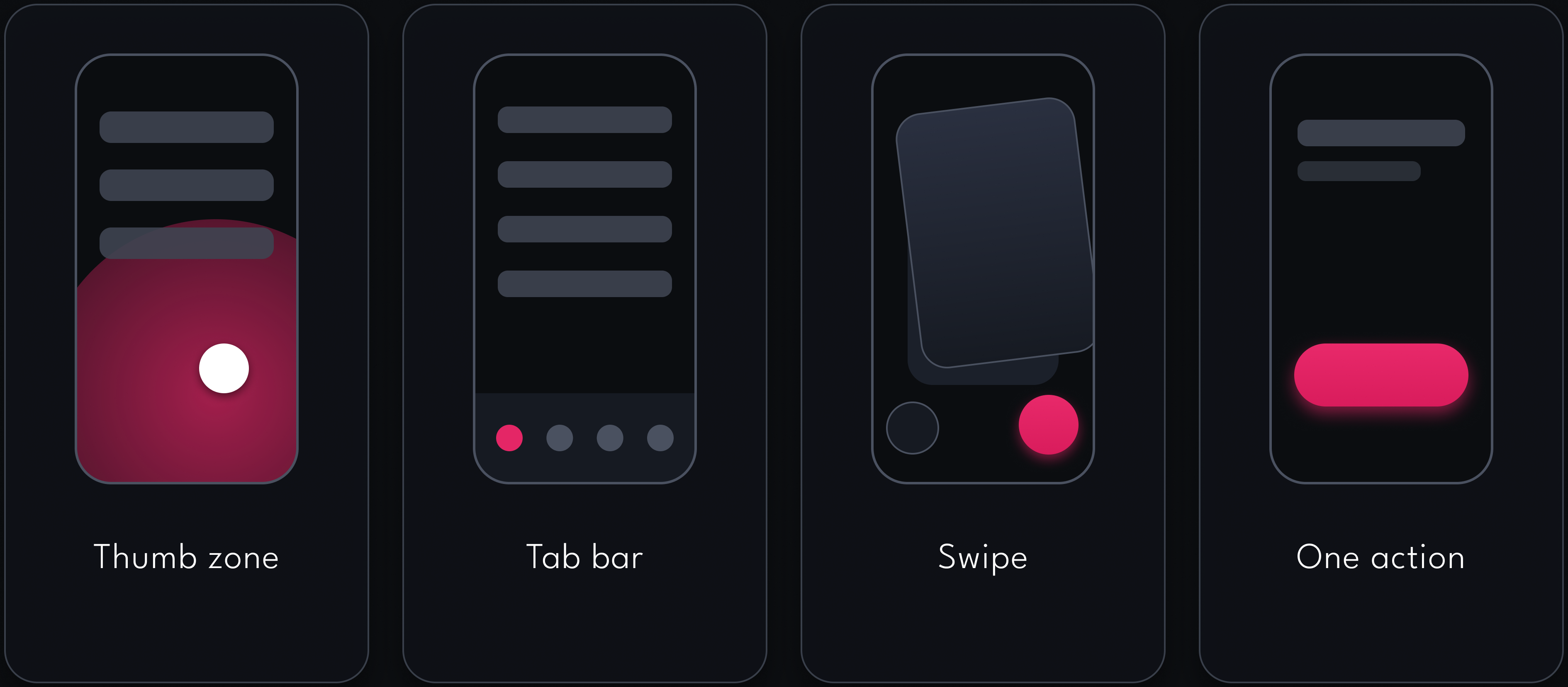
I researched the thumb zone. Most people are right-handed, and a traveling professional is often holding the phone in one hand, on a commute or in a car, so every interaction had to work with one thumb. That shaped the tab bar, the swipe and the single action on each screen.
Final screens
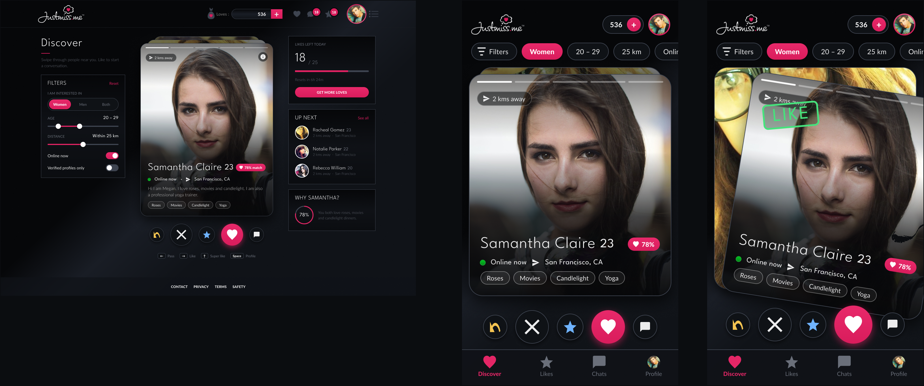
Exploration: swipe discovery
A swipe-style discovery screen with filters on the side, an up-next list and a like gesture on mobile. I made it as an exploration. It was never part of the scoped MVP.
How I decided what to design
Ten features were possible. This is how I chose three and left seven out.
1. I interviewed the stakeholders and looked at similar products
I interviewed the stakeholders, searched for similar products, and read competitors' marketing language to see who they were targeting.
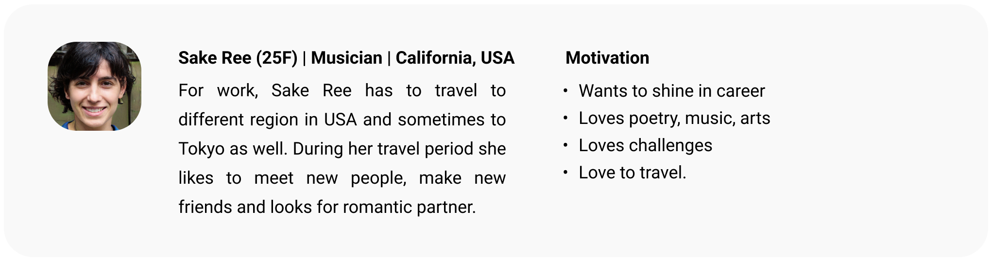
2. I created a user persona and analysed competitors to decide which features to build
User persona
Competitive analysis
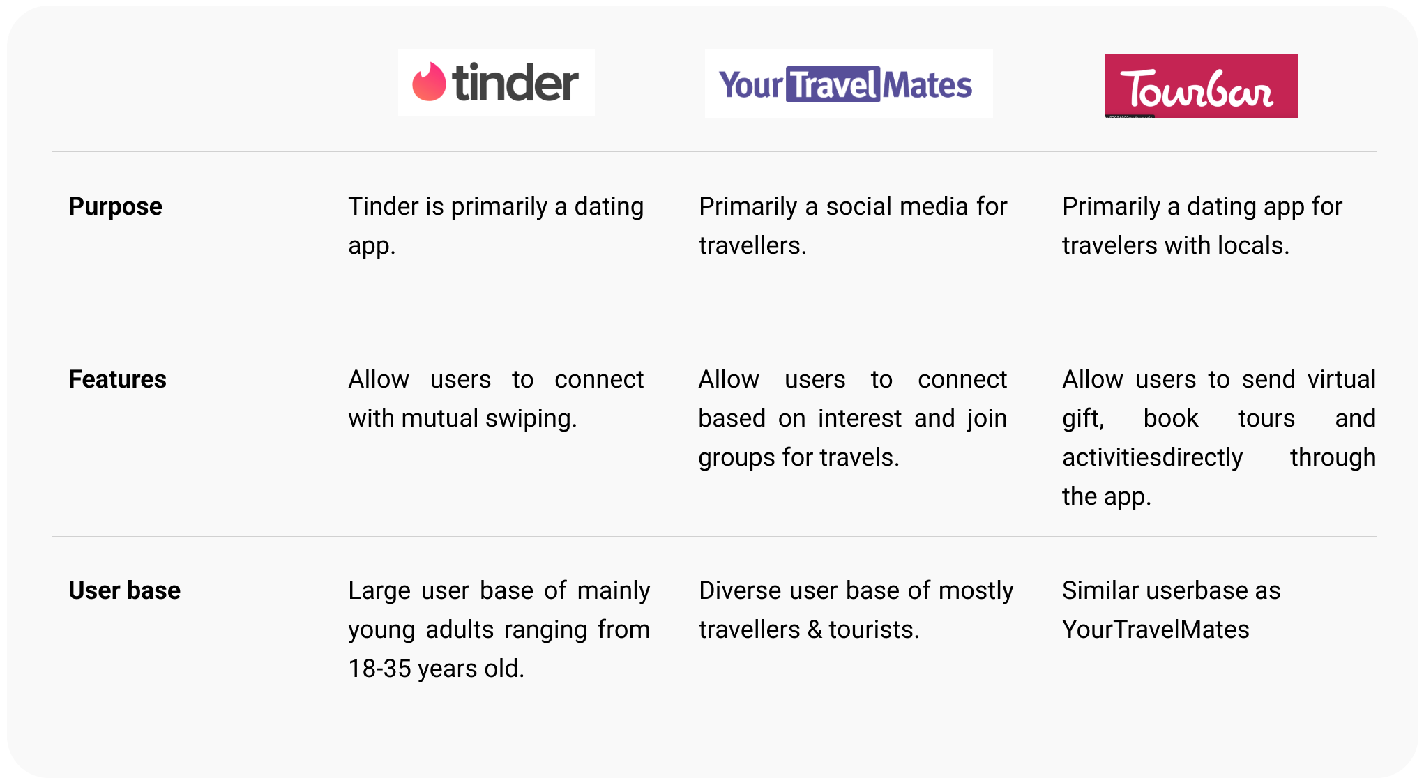
Three apps serve people who travel and look for a partner: Tinder, YourTravelMates and Tourbar.
3. We brainstormed ten features, then chose three to design and left seven out
With teammates and stakeholders, I ran a one-hour brainstorm around three keywords: Professional, Travellers, Dating. It produced ten features.
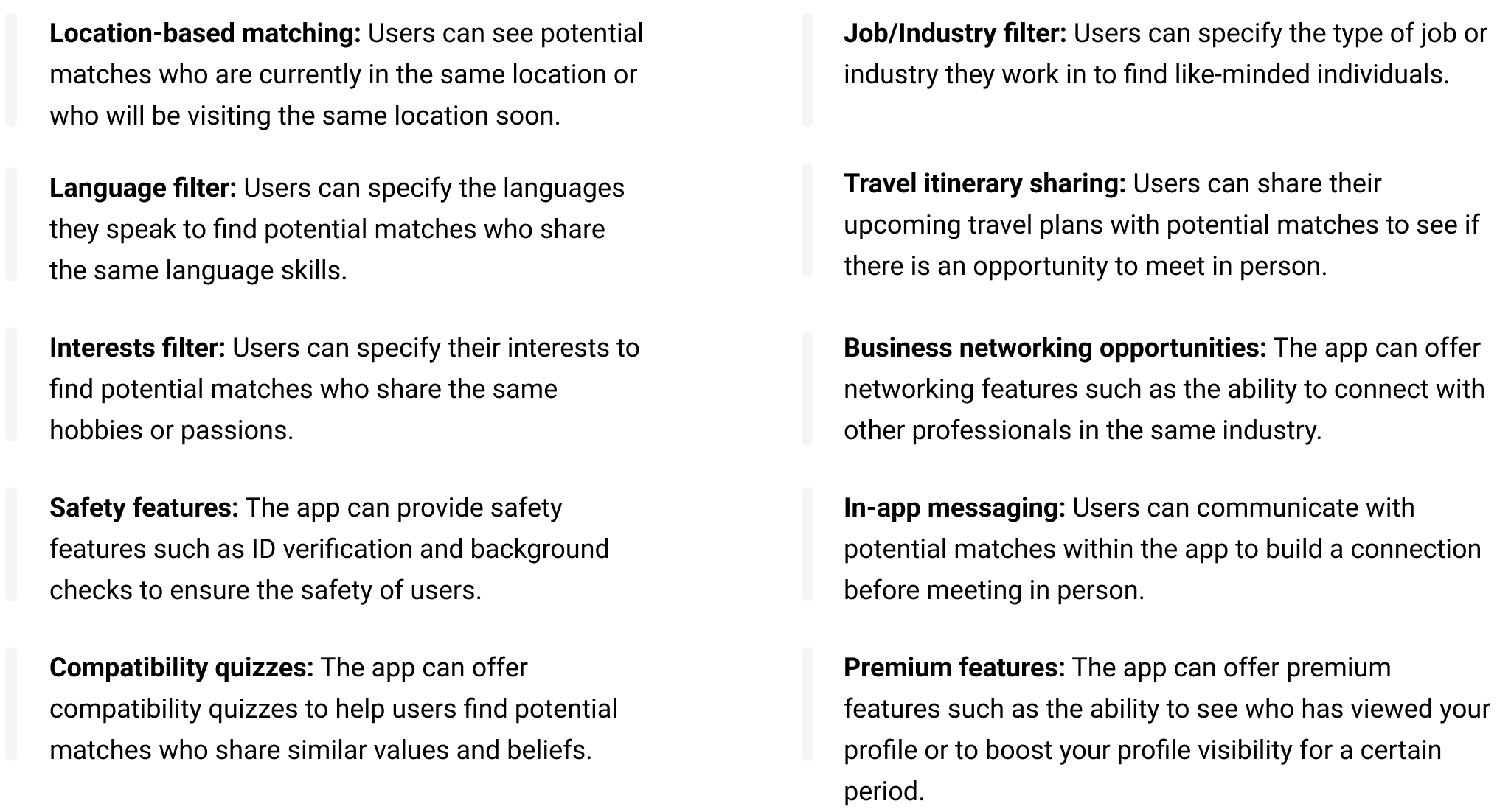
Since there were so many features, we decided to go with only three: location-based matching, an interest filter and in-app messaging.
4. Then I mapped the user flow
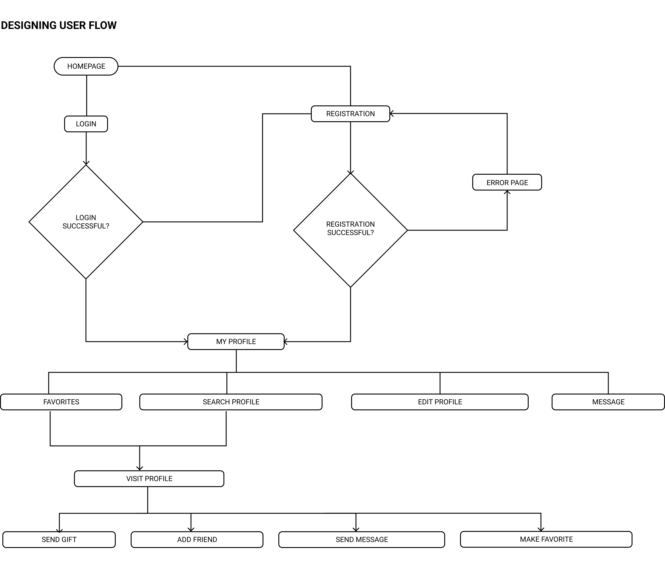
The homepage leads to login or registration. A failed registration goes to an error page and back to registration. Both paths land on My Profile, which leads to Favorites, Search Profile, Edit Profile and Message. From Favorites or Search, Visit Profile opens four actions: send gift, add friend, send message, make favorite.
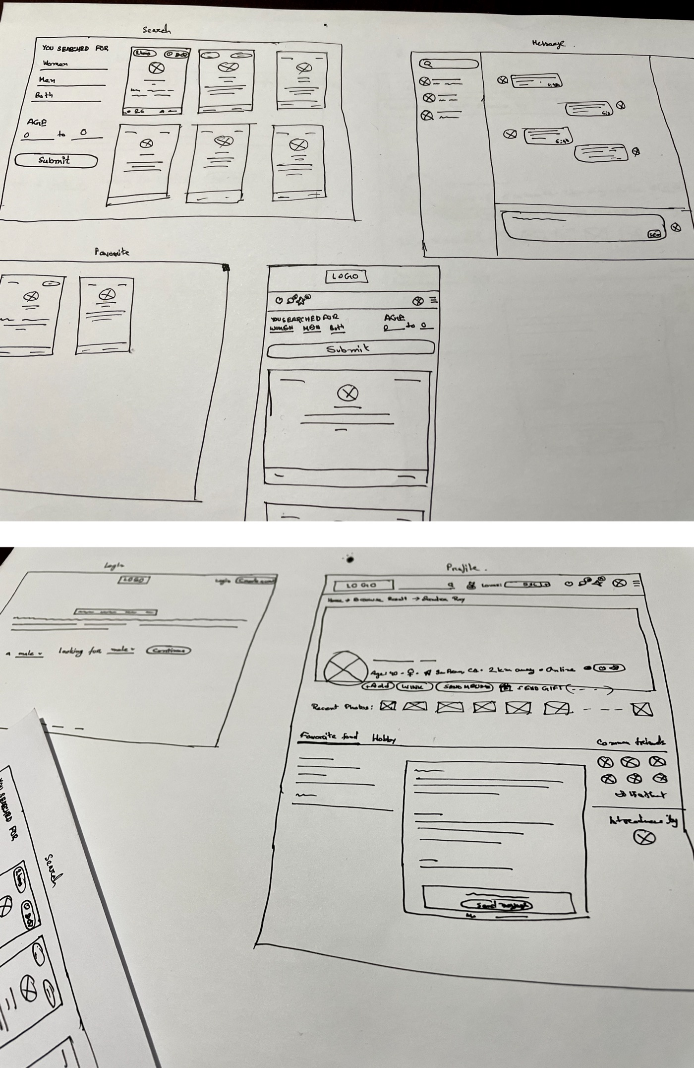
5. Finally, I sketched the screens
Design system
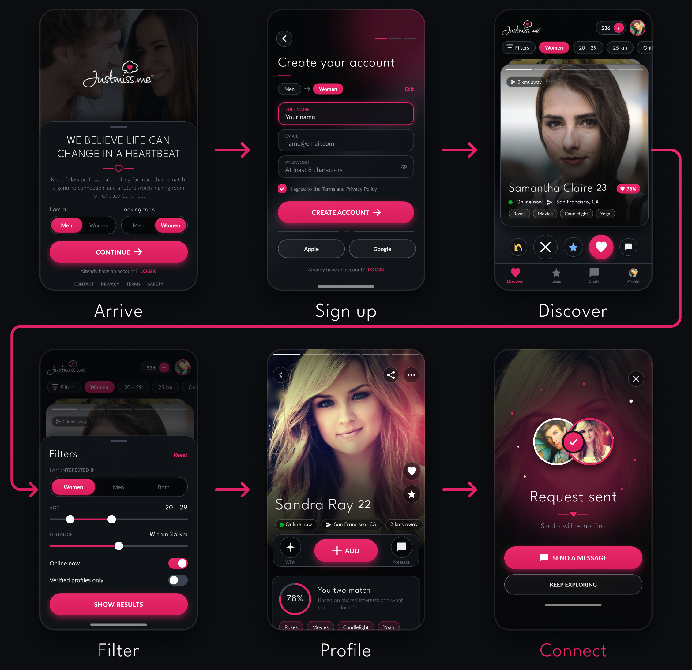
As delivered, the system used Bariol and Lato and three colors: #12171B, #E8296A and #FFFFFF. The elements sheet covered primary buttons in two sizes, send-love and favorites buttons, secondary navigation, select options, dropdowns, breadcrumb navigation and a match card with photo, distance, online status, name, bio and location.
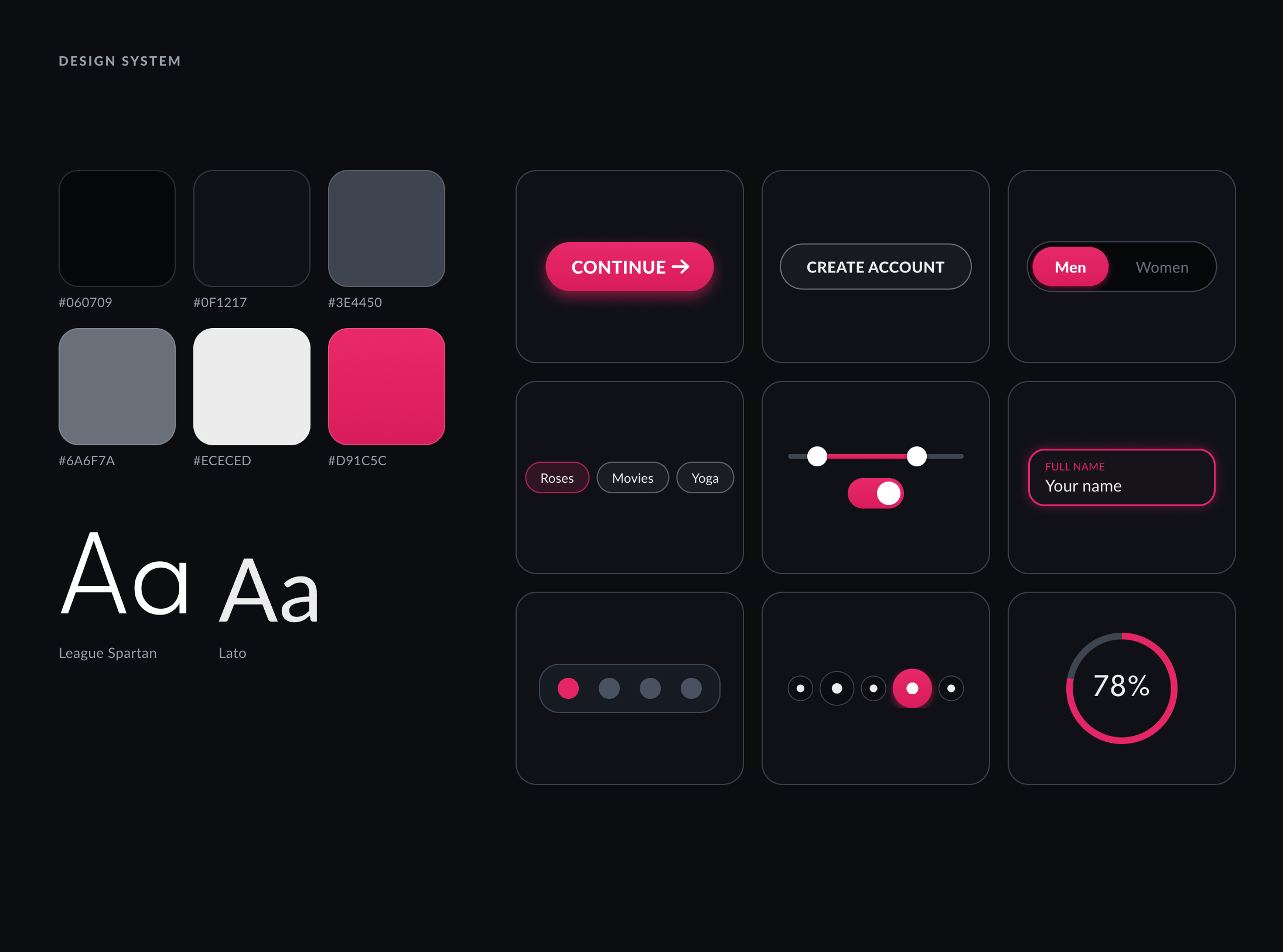
The revised system uses League Spartan and Lato, six colors, and a wider set of components: buttons, a gender toggle, interest chips, a range slider and switch, a labelled input, step indicators and a match-percentage ring.
Reflection
This was one of my earliest projects and it differed from my usual work, which I enjoyed. Looking back, much of the research, user testing, feedback gathering and post-implementation testing was thin. The persona came from stakeholders, the test group was chosen by them, and I have no record of group size or of what changed after launch.
Today I begin with why anyone needs the product, and I learn from the real users before I draw. Two habits from this project stay with me: cutting scope to what can be tested, and testing before polishing.