

Landfriends
Location based social media app
Landfriends is a location-based chatting app designed for people who are aged between 16 and 28. With the adoption of location-based technologies and services, more and more people are sharing their location with their friends, family members, and colleagues.
Introduction
People already share their location constantly. This creates a huge opportunity to connect people by location. At the time, few apps explored this idea: location-based social networking was still a nascent concept. Landfriends, a location-based chatting app, launched to fill that gap. Its core goal was simple: connect people nearby, enable real-time conversations, and let users share what they’re doing in the context of place.
My Role
Senior Product Designer
Being the only Product Designer within the team, I looked after the product from scratch. I worked with the developers, project manager, product owner, and a few other junior UI/UX designers whom I hired for minor design support and interaction design.
Problem
01 | Introverted young people who wish to engage with others at public events currently lack realistic options for initiating interactions without a physical approach. In many settings—such as concerts or sporting events—directly approaching nearby attendees is impractical or undesirable.
02 | Close friends and family members commonly share locations to remain informed of one another’s whereabouts. While apps like Google Maps and Find My Friends offer basic location-sharing, they do not provide the advanced connectivity features demanded by modern users.
Goal
Increase location-based connectivity
Allow people to choose if they want to share their location publicly so that they can connect with nearby strangers or privately with only a few people they choose. This should be done in a manner that people feel trust, safe, and comfortable. After that, the app can show further options that will inspire them to take action with other people/friends/family members.
Increase location-based interaction
Our goal was also to increase the interaction within the app. When interaction happens, happiness increases, and when happiness increases, the value increases.
Build trust
Users must feel safe and trust the environment the app offers because, without trust, users won't take necessary actions. The app should have options to immediately turn off the location of the users. Also, after installation, the app should show all the use cases, along with necessary permissions and how these permissions will be used to psychologically prepare users to feel at ease. That way, in the later stage of using the app, users won't feel threatened and quit the application. This was a very important goal for us to achieve.
Impact
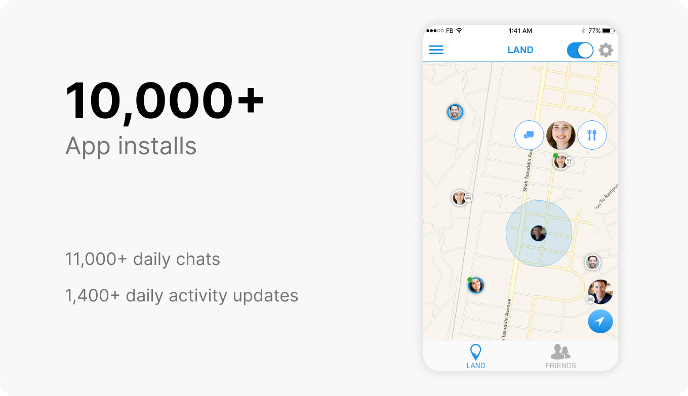
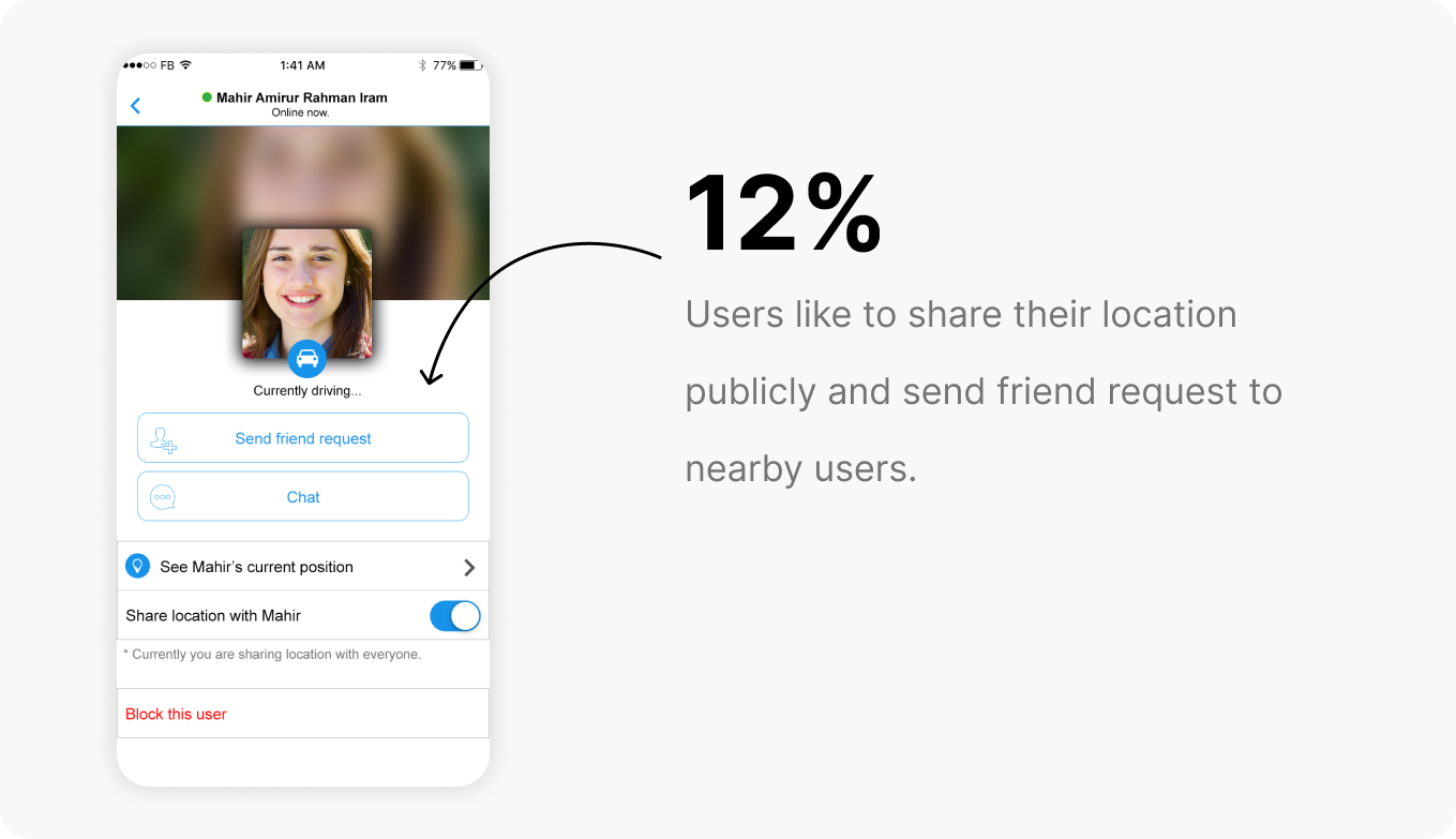
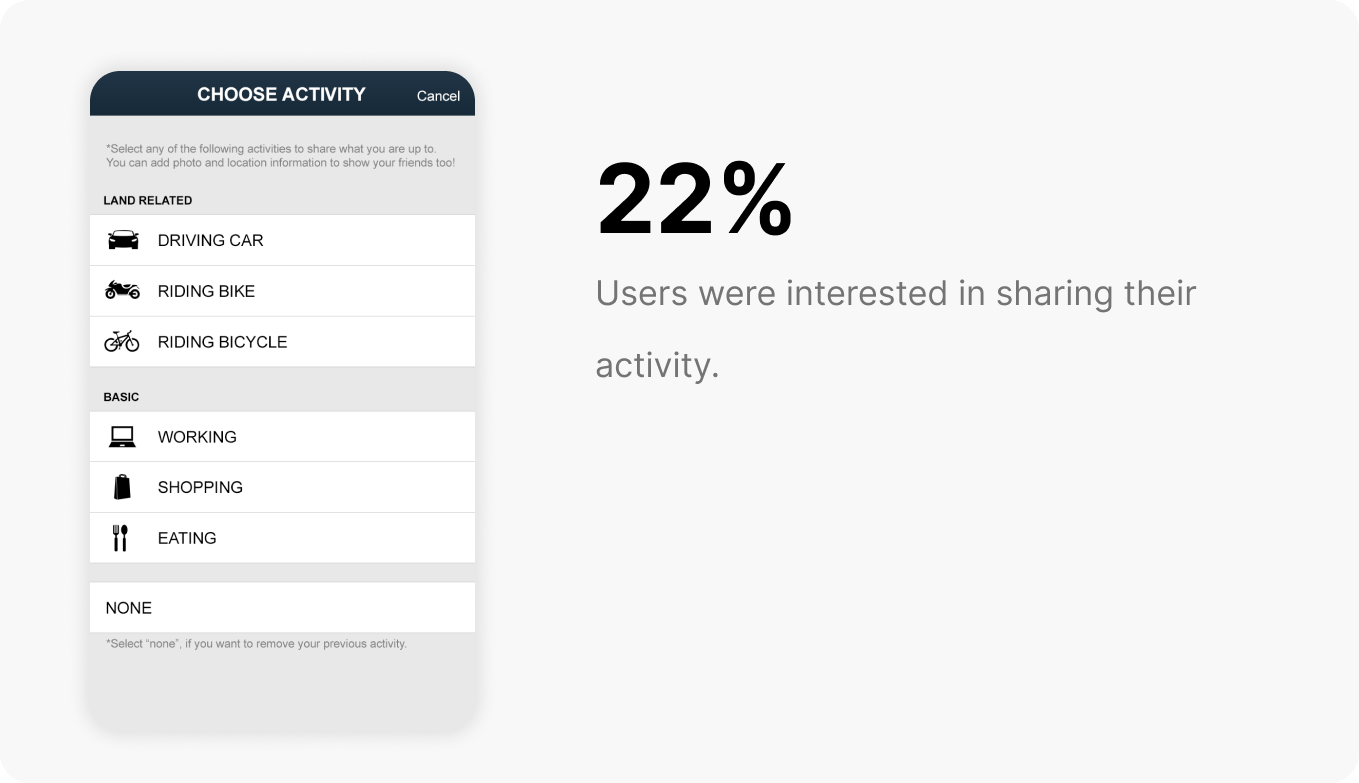
I did 100+ iterations in our design sprints. I kept launching new versions one after another. I kept solving experience and design issues in the next release which gradually improved the metrics. In a span of 6 months, these are our achievements:
User Personas
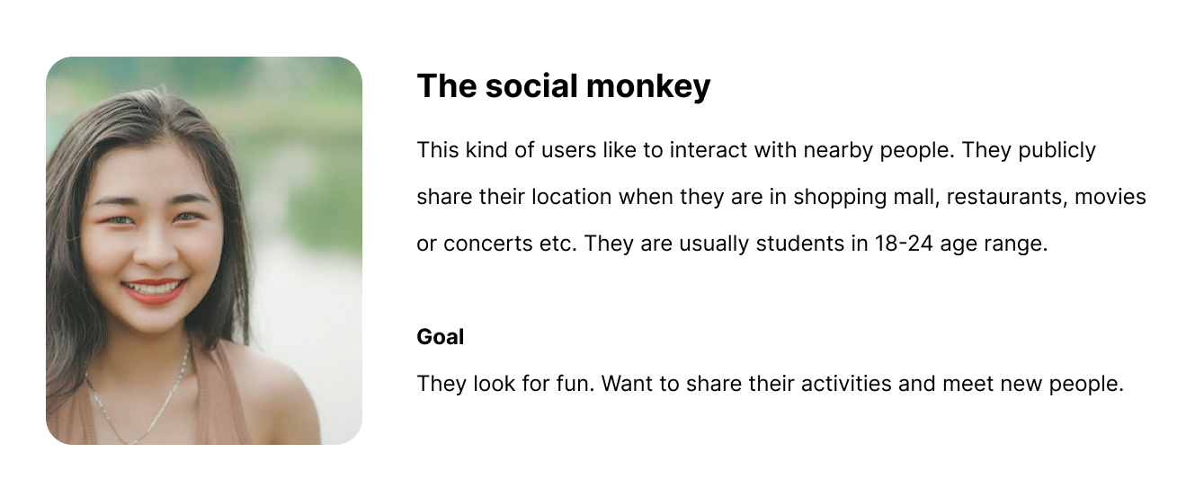
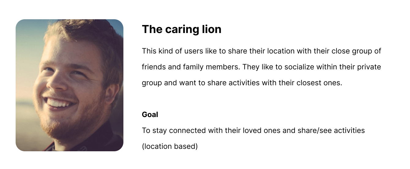
Based on our discussions with all the stakeholders (product owner, marketer, and project manager), I identified two kinds of users initially for whom I was supposed to design.
Process
1A. User Interview
I collected 465 emails from the marketing team that match our target user profile. The marketing team collected these emails from different sources such as social media, lead magnets, surveys, etc. I created a questionnaire (which you can check below) and sent the 465 people's emails using Mailchimp. Only 4% participated in the survey. I called the rest of the people politely, asking them to check their email and participate in the survey. (It took too much time to do the calls, so I used a junior associate to make the phone calls). After the phone call, more people participated. Finally, we got 55 participants (which was not a bad number to start).
1B. Survey Questionnaire
2. Design Sprints
I conducted design sprints for better collaboration with all the members of the team. Design sprints are good for brainstorming sessions and it helps all the team members stay connected.
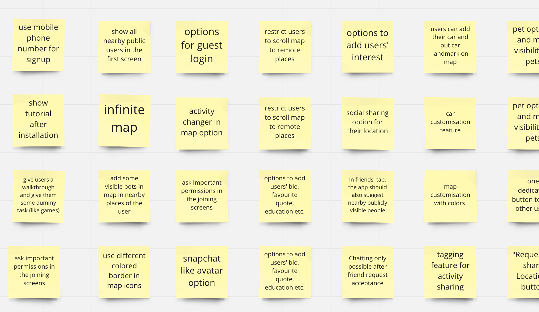
(Miro screenshot of feature list)
3. Brainstorming
In our brainstorming sessions, we focused on getting as many ideas as we can. Quantity over quality was the main focus. "There are no bad ideas" - was the mantra. Brainstorming sessions were helpful for full team engagement where all the team members could speak freely with their minds.
As the only Product Designer in the team, I had to make sure no ideas go unwritten even though it may sound like "it won't work" at the first place. I used to apply "Impac vs Effort" metrics to prioritize ideas. It means ideas that need less time to implement and have a higher impact on our goals should be executed earlier than those which need more time and comparatively have a lower impact. I use Miro to document ideas and shortlist those for execution.
4. Competitive Analysis
I researched some of the competition from different regions in the world but targeting the same kind of users as we are. I installed those applications on my phone and used the apps. I read their users' feedback and checked their ratings. I was just interested in knowing more.
What I learned was surprising! First of all, people were really interested in sharing their location with other people and wanted to socialize. These applications are already having millions of users who use the apps regularly. This proves that our goal is achievable and we are on the right path.
From my research, I would like to point out the best three of the competitors:
Glympse: A very amazing location-sharing app. Friends and family members use to always stay in touch location-wise. They do not offer any chatting or interaction option.
Life360: Another cool app that focuses on location sharing. It is fun and colorful. The chat feature is missing.
Snapchat: Although Snapchat's main focus is not on location sharing, it did a tremendous job in showing customized avatars on maps and providing amazing intractability to its users. It needs no further mentioning that, Snapchat is an awesome chatting app.
I was already filled with tons of ideas about what our "LandFriends" app will look like. I became so excited and couldn't wait to start.
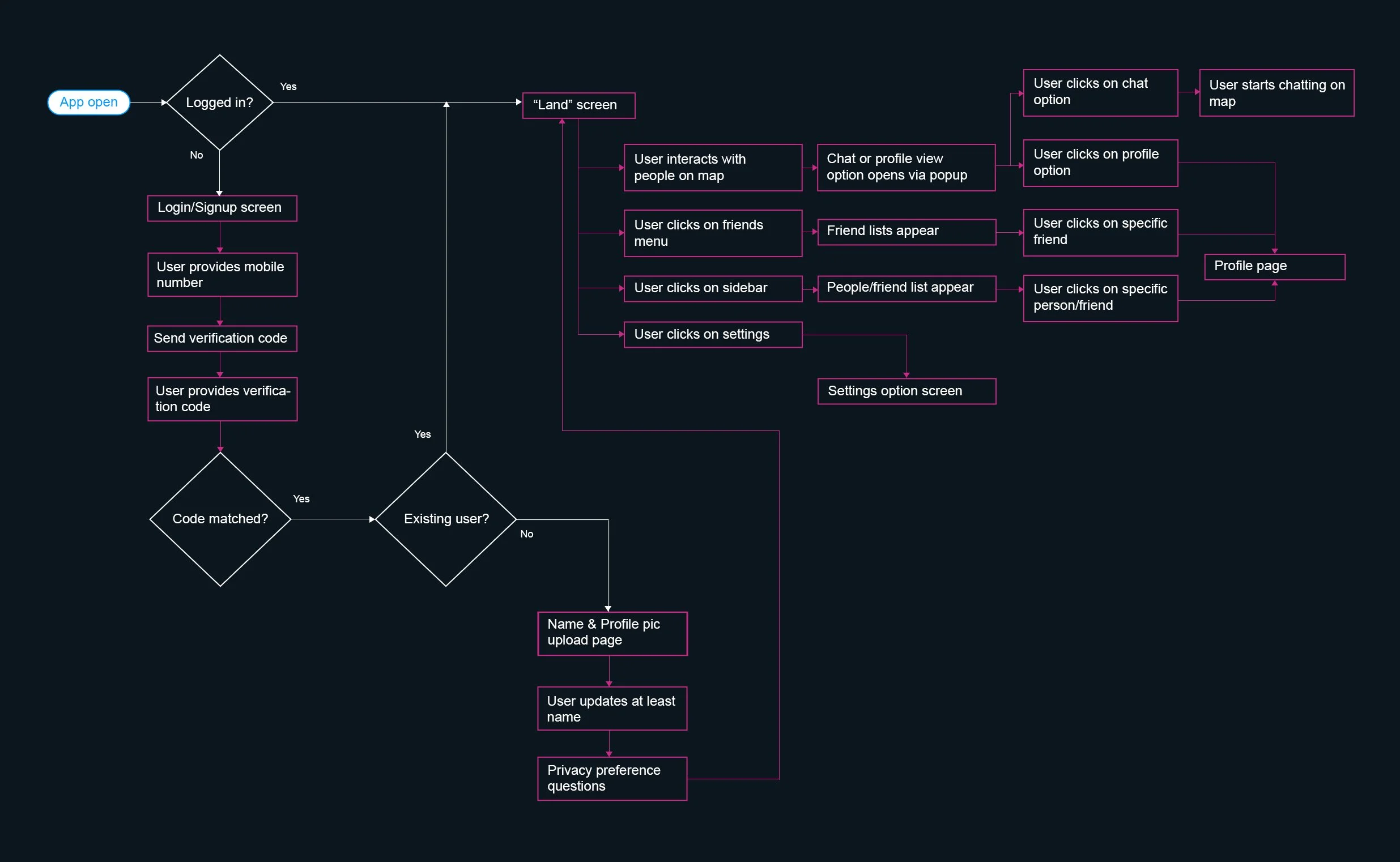
5. User Flow
So far, I have done at least 50+ different iterations on different user journeys to find the easiest and most pleasant one. Finally, I have reached this:
6. Sketching
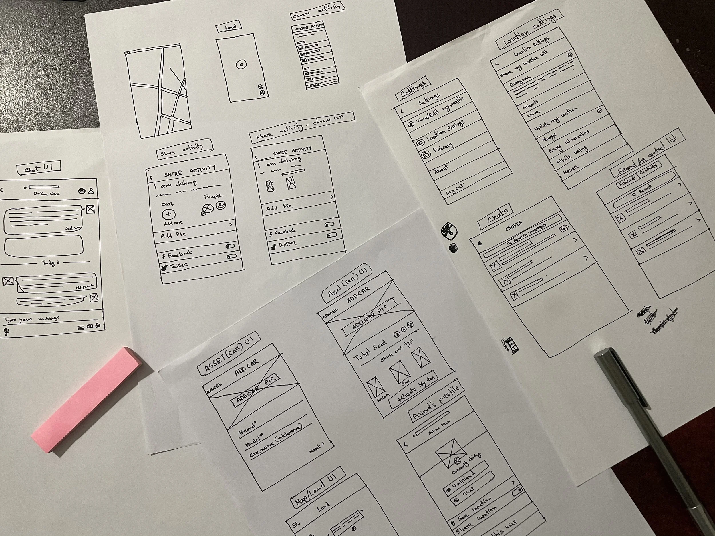
I have done at least 100+ different iterations for different flows and screens. In the overall process, I have always reminded myself, "I am not the user".
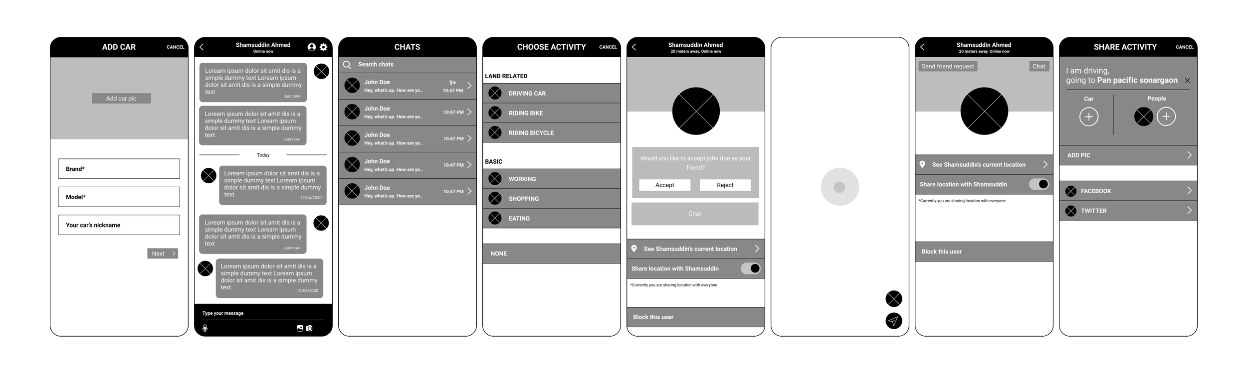
7. Wireframing
A sneak peek into the wireframes
8. Early Designs
After our initial research and ideation, I created some early designs to show to our target users. I was looking forward to doing usability testing and building the initial MVP (Minimum Viable Product). My early designs took at least 10+ iterations on each page due to some decision changes, business focus shifts, and/or new ideation.
Signup Screen
The signup screen was very important to me because this is the page where new visitors drop off. Most of the visitors do not want to go further by sharing their email/mobile at this stage. I was careful designing this page.
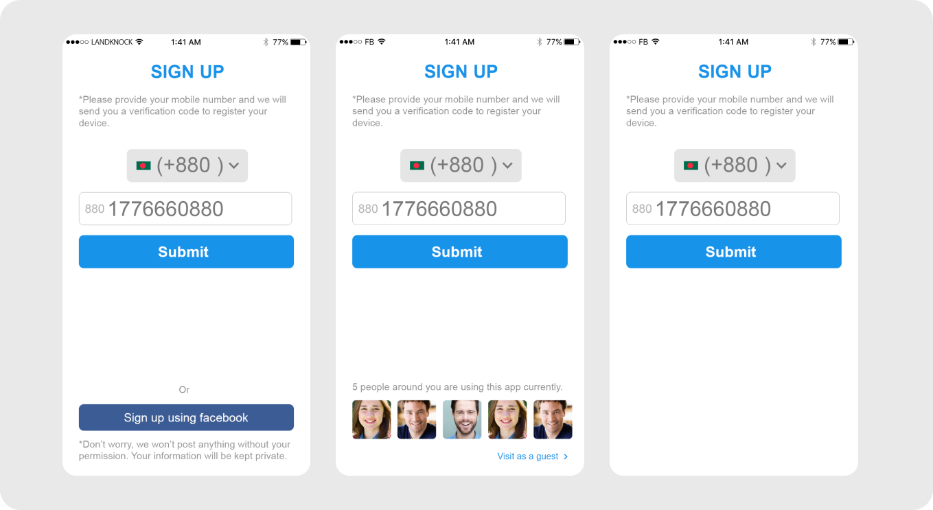
(Here are 3 different versions of the Signup screens I designed to test)
Map/Land Screen
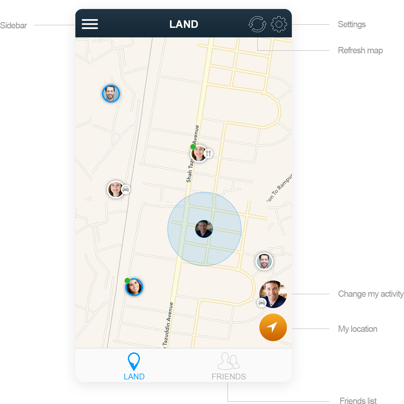
This was the core screen in our application. As it was a location-based application where the geographical interface was most important, I had to be cautious that the interface did not become dull.
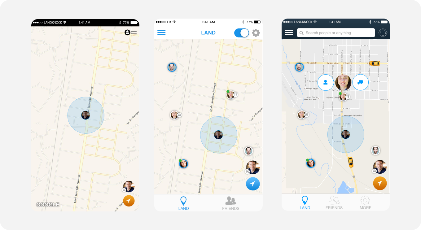
(Here are 3 different versions of the Map/Land screens I designed to test)
Nearby People
Another very useful and important interface I needed to test in the early versions were the interface for Nearby People. I've put it in the sidebar so that it has easy access that gives the users the felling that they are still on the map.
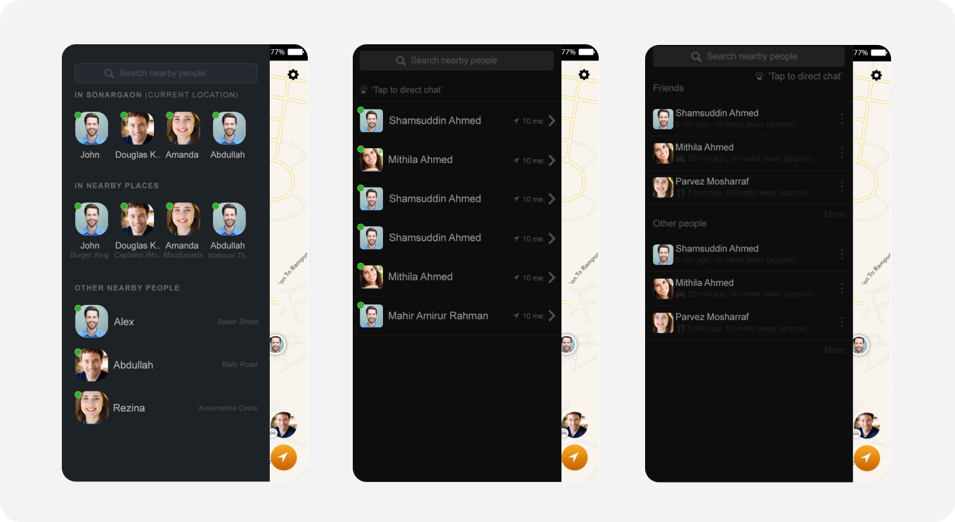
(3 different versions of nearby people sidebar)
Usability Testing
It was then time to test how the users interact with the app. Based on that, we will get insights about the next steps. Usability testing is very important for the design team to evaluate all their previous hypothesis, ideas, opinions, etc.
We invited all 55 participants from the previous questionnaire session to a luncheon session I hosted. Only 8 participants joined, but that was enough for us to do the usability testing.
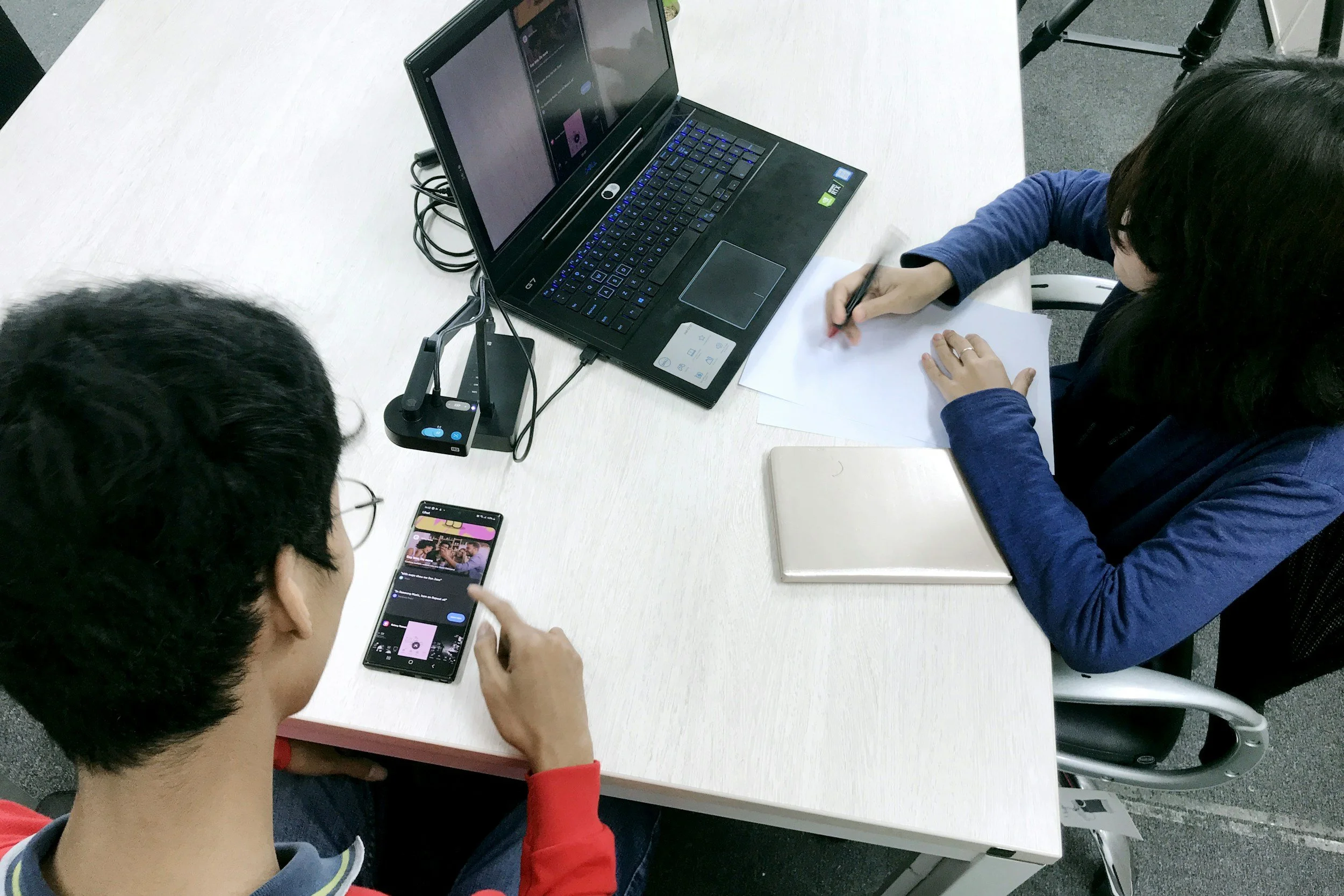
(Unfortunately, I don't have any real photos available. But the above image exactly shows how we did the usability testing. We asked the user to use the prototype and took note of every user interaction, mistake and conversation)
9. Final Design
Onboarding Tutorial
In the final design, I have added onboarding tutorial sliders for the users to understand the application's use cases, features, and functionalities.
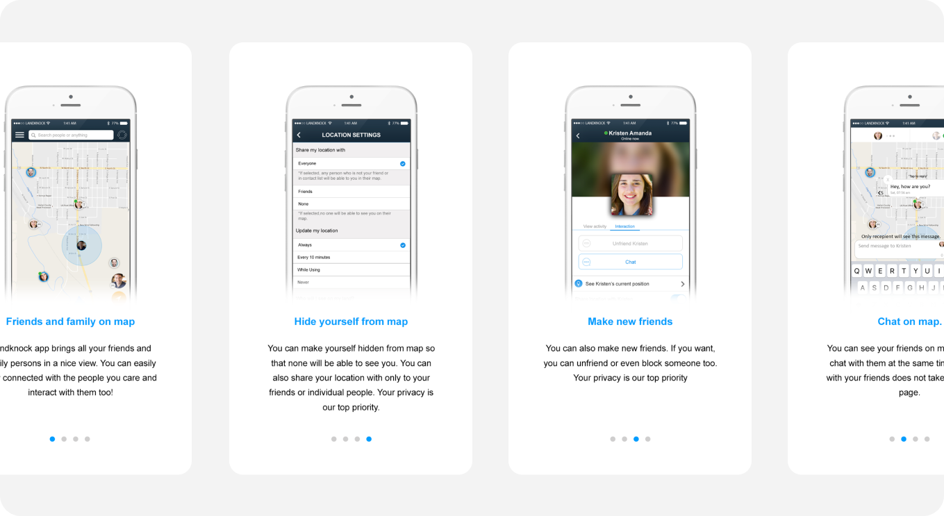
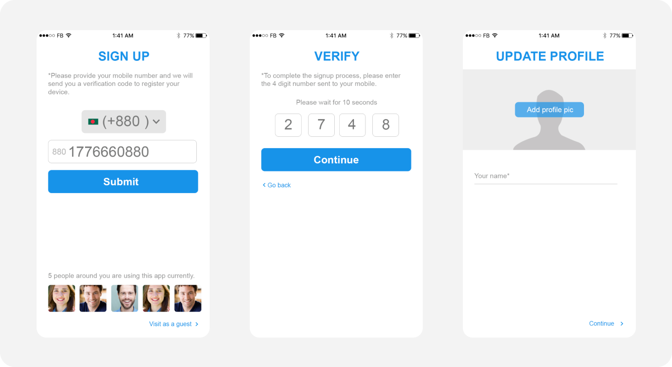
The joining process was made simpler than before. Users will use their mobile phone numbers to register, and they will receive a 4-digit pin code to join. The PIN code delivery time will not take more than 60 seconds.
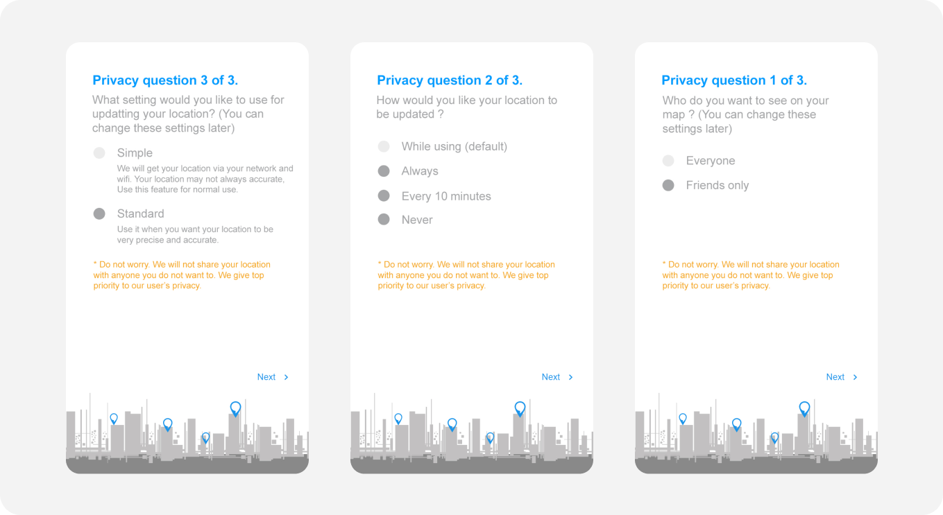
Privacy Questions
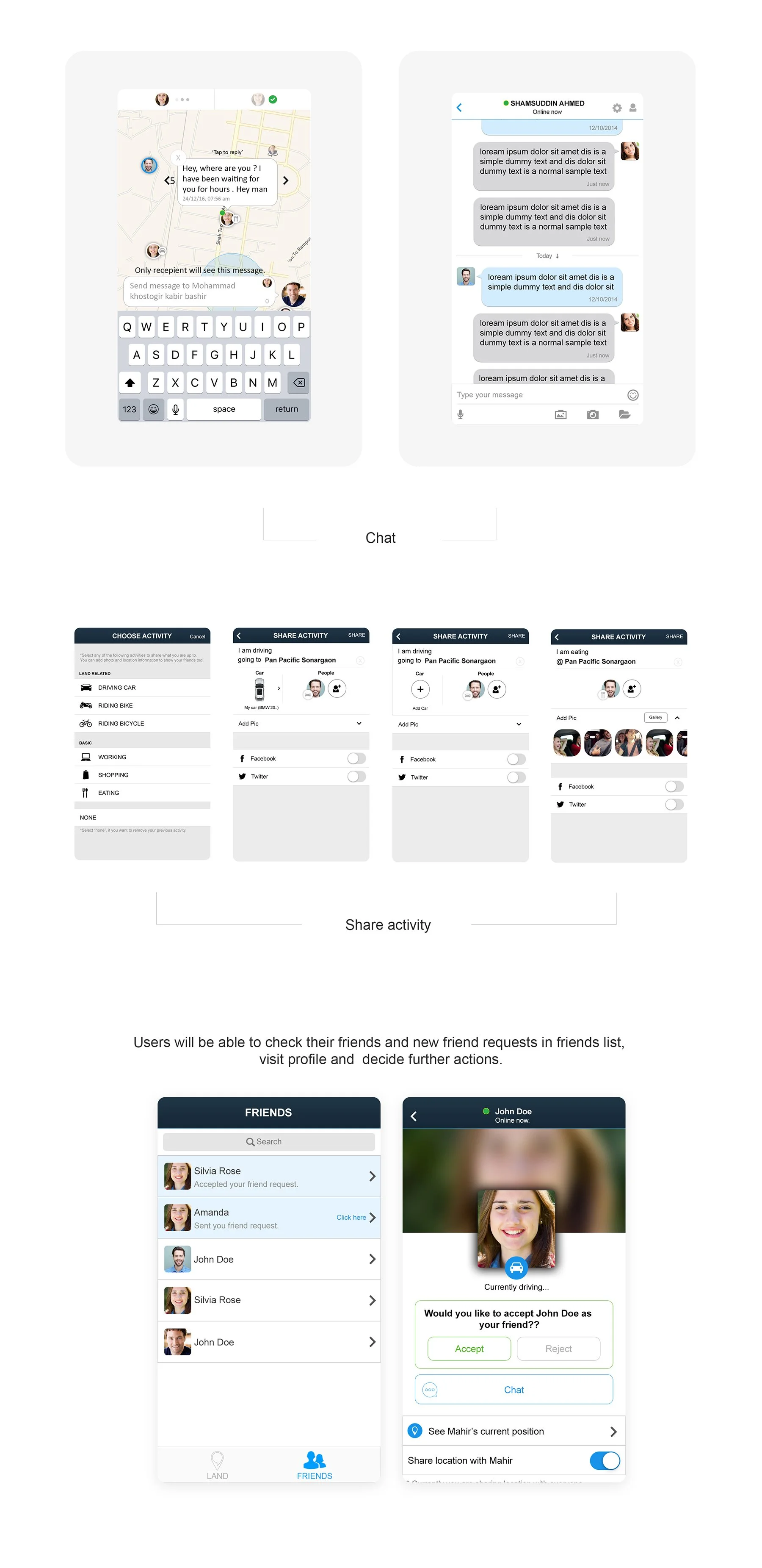
Based on our usability testing, we found that it is better to ask privacy questions immediately after joining. It serves two purposes, numer one - it shows the users that this app is genuine and trustworthy, and number two, it helps the first-time users to understand the app's features better. When users see these questions, inside their minds they are thinking, "Oh, I can also do this? wow"
Component Library
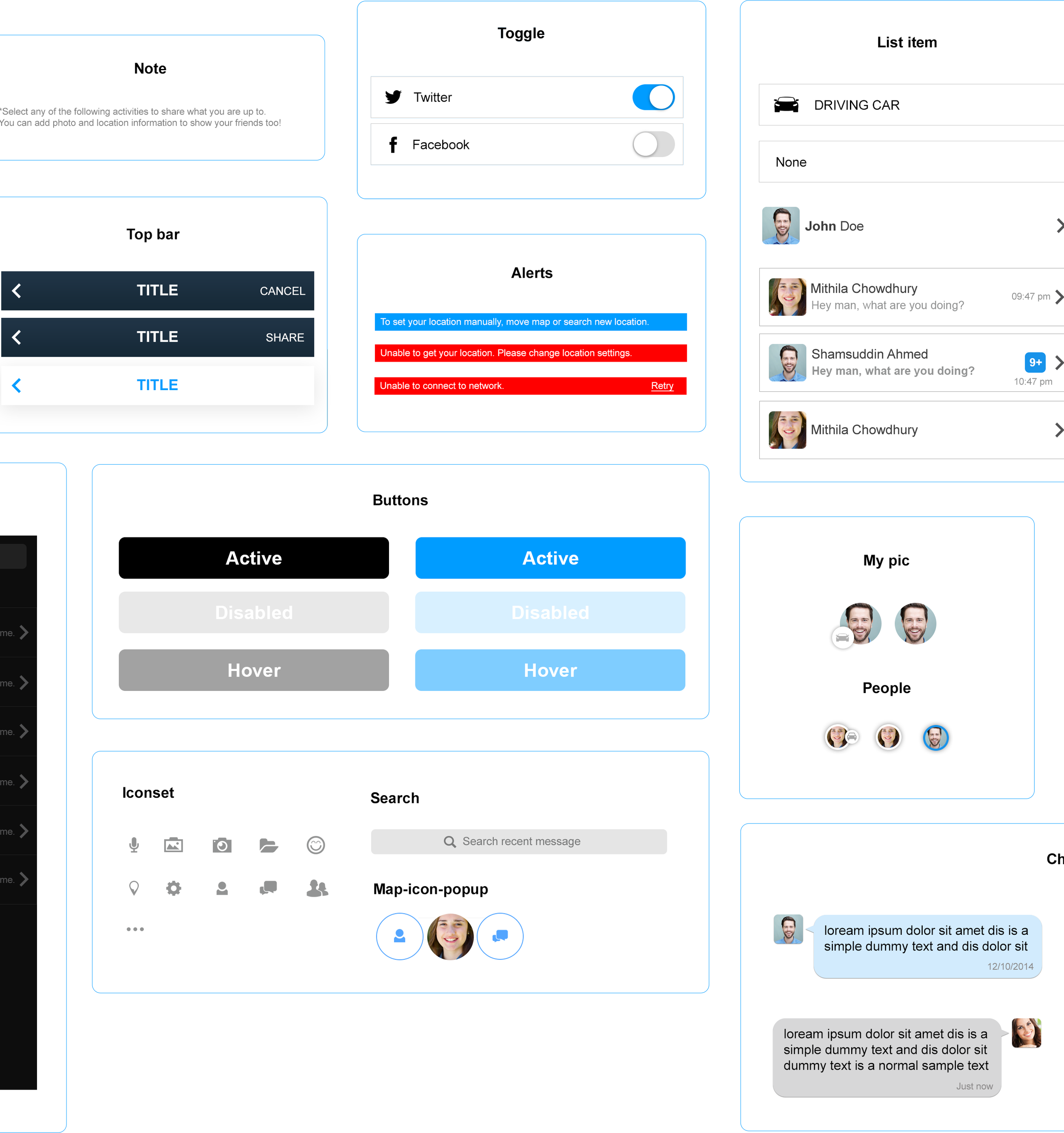
I built the entire design system from scratch and made sure that every component is reusable. Constant communication with the engineering team helped me construct the library.
Maintained a separate page for icons, texts, colors, and components.
Learnings
Working on this project, I have learned many things. Most of all, I have learned how consumer apps are different than other kinds of applications out there in the market. Although the number of things I have learned is many, I would like to point out a few things.
User persona for a consumer app is diversified: During the process, whenever we thought that we already knew about our target users, a new kind of user type (or user persona) would appear which none of the team had ever thought. Even if we like to define our users by age, so many different categories come up within that same age range. Designing an app for all those different user personas is not easy. Therefore, in order to be successful, it is always better to start the conversation with the target users and stay humble. My learning was to find the common elements among all those different kinds of users and then design.
Business decisions may change: Oftentimes I had to deal with tight deadlines due to some decisions from the management. Oftentimes, even focus changes. It is a good idea to always be prepared for any kind of decision changes and adopt as per that. My takeaway is that it is always better to launch with what I have than to wait to make things perfect. "Launch first, then keep improving" - that's what I learnt
Future
The design process never reaches its end. We have more new features in our "feature list" that are yet to be introduced. On the other hand, continuous improvement based on users' feedback is still there. So far, in the near future, we will introduce the following:
"Add Car" Option: Users will be able to add their car and put a landmark on the map. We will add some cool features like car color customisation and car icon customisation, which will be visible on the map.
Image upload option in activities: Right now, users can only share their limited activity by icon change. Soon, we will add an image upload option, so that users can also share their moments. These moments can be visible to their friends and nearby people (based on their security preference) on the map.
"Add Pet" Option: Just like the "Add Car" option, users can also add their pet and create icons for those pets to be visible on the map. Our designer team will give multiple customisation options for the pet's avatars and types such as cats, dogs etc.