
Landknock WFMS - Web App
Enterprise Workforce Management Software UI & UX - MVP to 20K+ Users
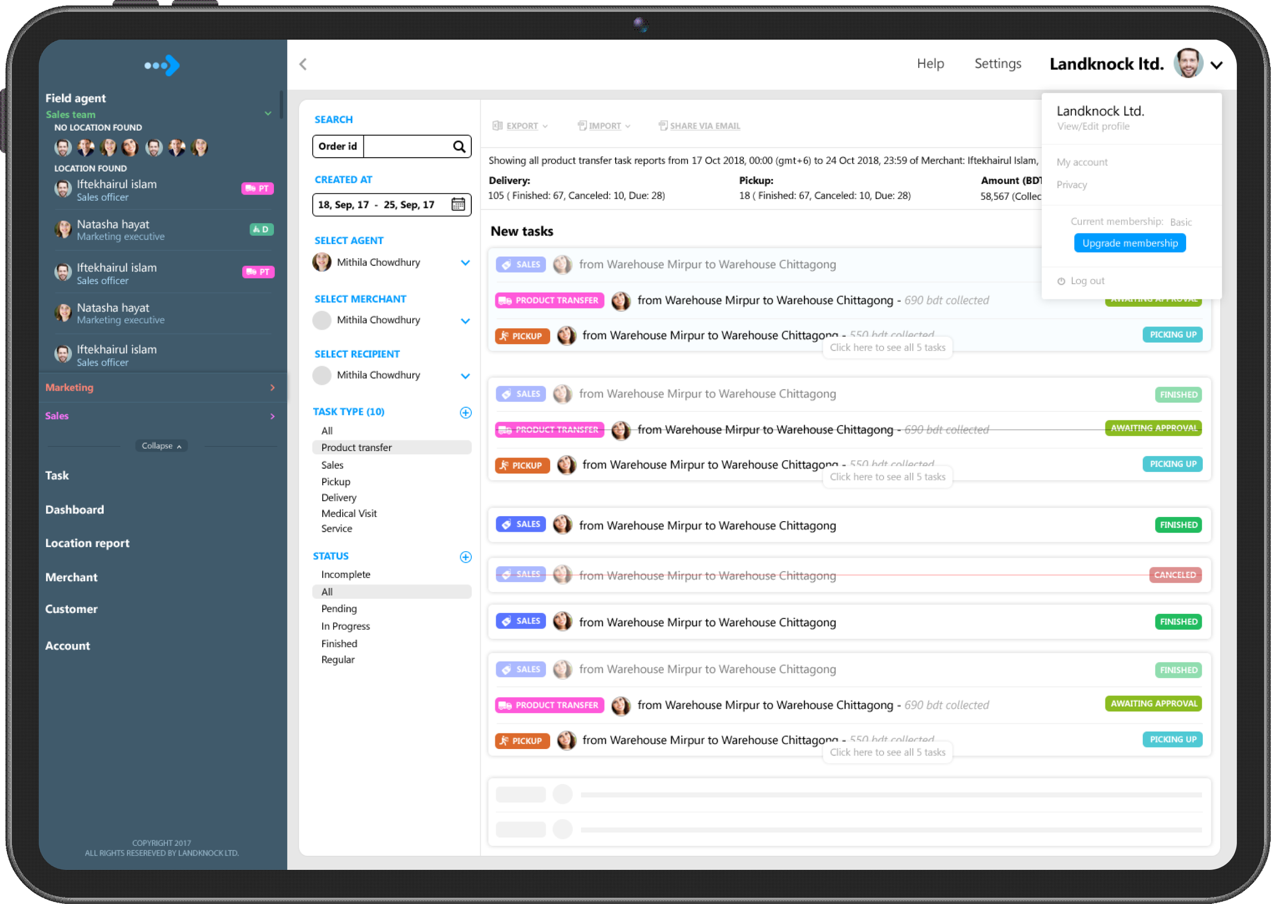
Introduction
After launching the Landfriends app, many enterprise-grade big corporations contacted us to build a Work-Force Monitoring Solution for their internal use. They liked the map functionalities, location sharing features, and activity features we did in the “Landfriends” app and wanted the same for their Work Force Monitoring Solution, or in short, WFMS. So, we all called for a meeting to decide how we can go further, what to do next, how we can launch it, how we can package the solution, make it market-ready, and most importantly, who will pay for this solution.
I realized this has huge potential. Instead of building only for “one enterprise customer”, how about we build it for Banks, FMCG, Pharmaceuticals, Multinational Companies, and Distributors? It will be a customizable Workforce Monitoring Solution for companies of any scale who want to monitor their field workers. That’s how “Landknock Workforce Monitoring Software,” a B2B SAAS product, was born
My Role
As the product idea was mine, this time the company made me “Product Owner” for this product besides my “Product Designer” role. Being the only “Product Designer” in the company, I was already taking on a lot of responsibilities. So when the company assigned me the “Product Owner” position also, I started taking the business-side decisions for this product, such as how the customers will pay, how it will make money, who will be our primary customers, etc.
Throughout the whole project, I worked with the marketing team, developers, and project managers in all the steps of designing the product from scratch.
Problems
Most of the managers/supervisors who have field-working human resources working outside of the company have no clue whether or not the field workers are visiting the assigned sites and doing the job perfectly or not. There is no transparency.
Having no input systems for the field workers creates unproductivity and makes the organization heavily paper-dependent.
Due to paper dependency, field data are not available in real-time. This creates a delay in management decisions, which in turn results in revenue loss to the company’s income.
One of the core reasons companies fail to meet their revenue target is because of the field workers’ productivity loss, which happens due to the lack of a transparent automated system to keep the field workers on track.
Goals
Achieving More Transparency Between Field and Head Office
Providing a High Level of Productivity
Providing Access to Real-Time Data
Increasing Trust
User Persona / Ideal Customer Profile (ICP)
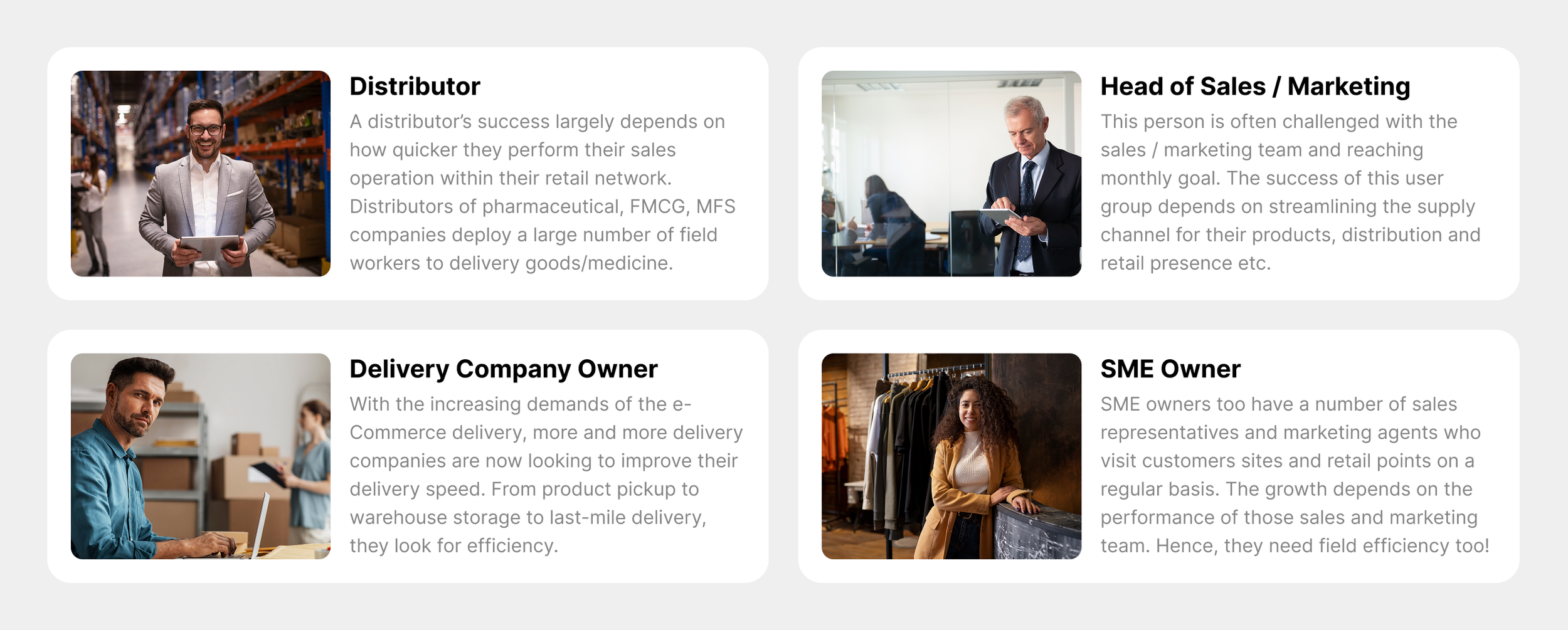
Based on our research, there are four kinds of users/organizations who would be interested in our web application.
UX Process
The process for creating this application was a little bit different than all my previous projects. The first challenge was interviewing users. It was not easy to interview the target users. The second problem was that, in all my past projects, I could check the competitors’ websites/apps to get some ideas about the industry. But this time, we were targeting diversified industries, and other available similar applications were not helpful for my inspiration. However, I really enjoyed the journey this project offered me from start to finish.
User Interview
As our target customers were enterprise people or company owners, it was not an easy task to reach them. A simple Google Form or SurveyMonkey form was not helpful for this kind of customer. What I did was, I tried to reach people I know who could connect me with all those company owners, department heads, etc. I tried to set up an appointment with them. This is how I would reach them, “Hey Mr. X, I am Mahir, a Product Designer from Landknock Ltd. We are working for a product for your industry that would solve some serious problems you are having with your field workers/workforce. I just need a few minutes of your time to learn some important matters regarding what happens to the field, what the problems are, and how, using technology and automation, we can solve the problems. Can I get a time of yours to sit with you to learn more?”
Most of the time, the person would say things like “I am busy, can you call me later?” Very rarely, the person would agree to sit with me. I remembered that in order for me to get 1 person to agree with me, I had to call at least 30 people. Anyways, with the support of my colleagues and other friends who work at reputed organizations, I could find 3 top-level executives who agreed to sit with me and help me with information.
Although the discussion varied for different persons, there were some fundamental questions that I asked all the 3 persons I sat with. I’ve shared the questions here.
Although I actually asked more questions based on the discussions, the 5 questions were common for all 3 interviews. Discussing with these 3 persons, I could already realize how serious the matter is. I could also learn some competitors’ names from them, but they are not using those solutions because of the high pricing.

Design Sprint
So far, I have performed over 30+ iterations for this project. The more iterations I did, the more mature and improved the product became. Needless to say, all the feature development was not possible in the first launch. We had to keep releasing again and again for a good amount of time.
Brainstorming
During our design sprints, we did brainstorming sessions to share information on other similar products offering similar kinds of solutions. From these sessions, we could shortlist many important features which already matched the problems I found during the interviews. In the brainstorming sessions, all the stakeholders were present. I did not like to omit any single person from the Brainstorming session. Even a junior designer whose responsibility was to document the product journey was also involved in the brainstorming session.
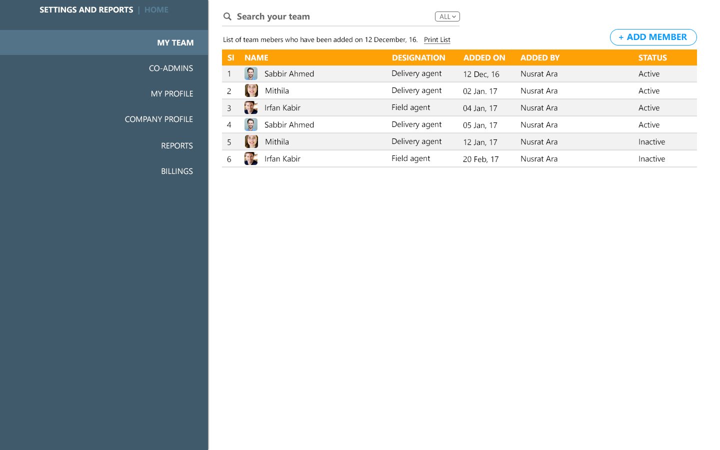
We created an MVP to validate the product-market fit
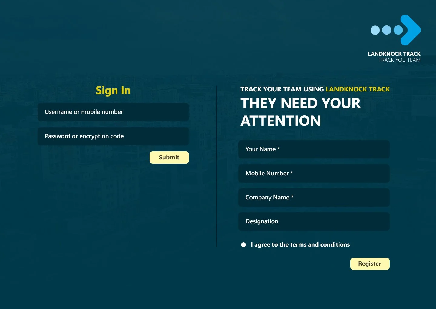
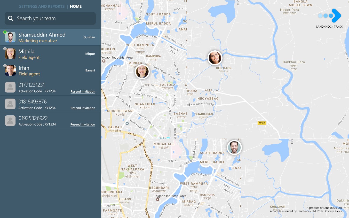
As part of our empathy process, we created a very cost-effective “not so good” looking MVP to show to our ICP. My team was initially against it, but I told them, “This will validate our research. If nobody is interested in the MVP, no need to go for the expensive building phase of the full product”. This was the best decision in our product-building journey. It saved 6 months of our product-building time and gave us early traction!
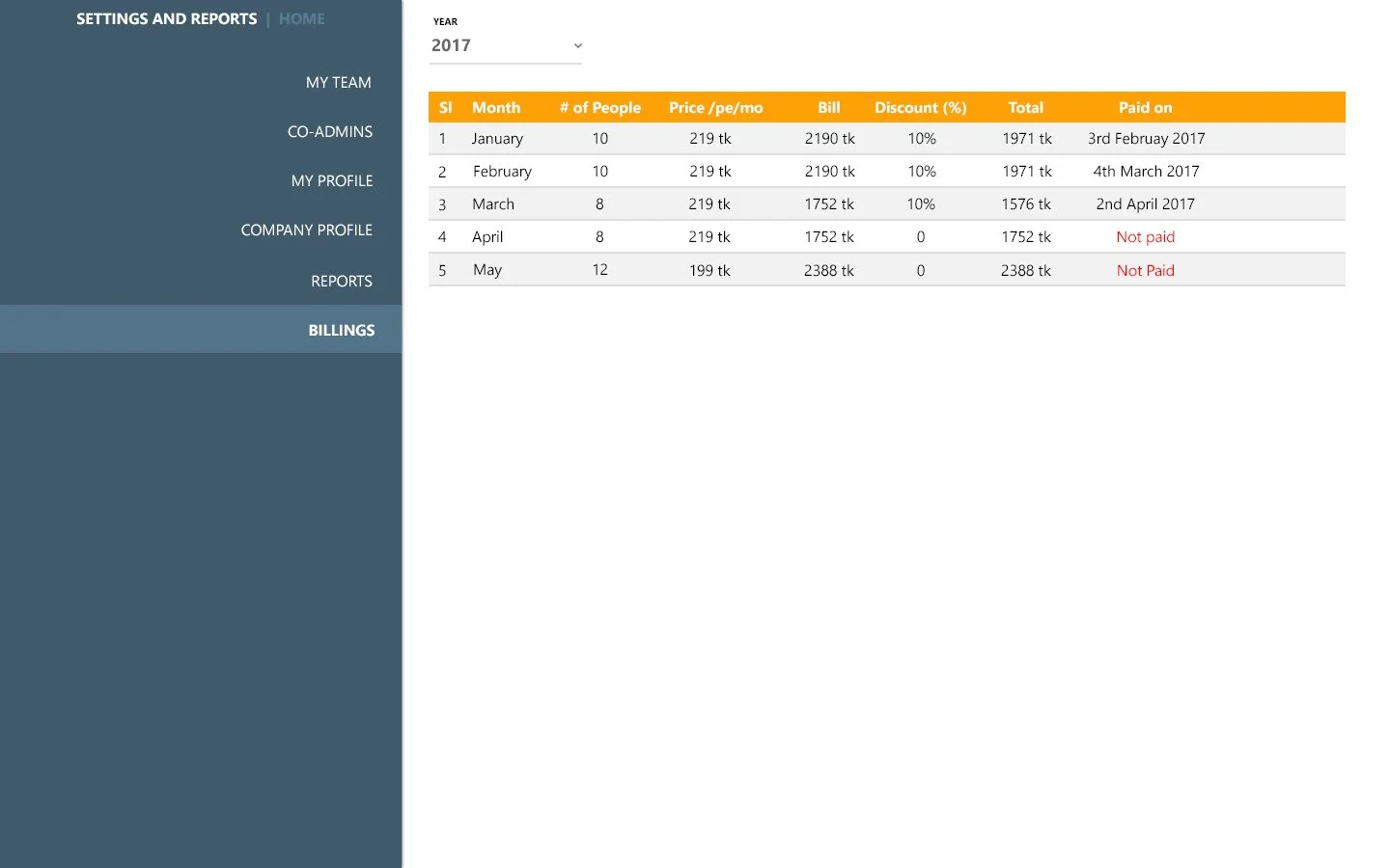
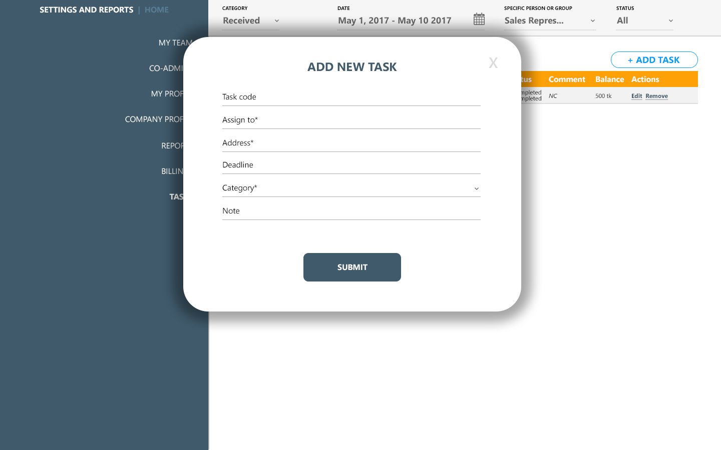
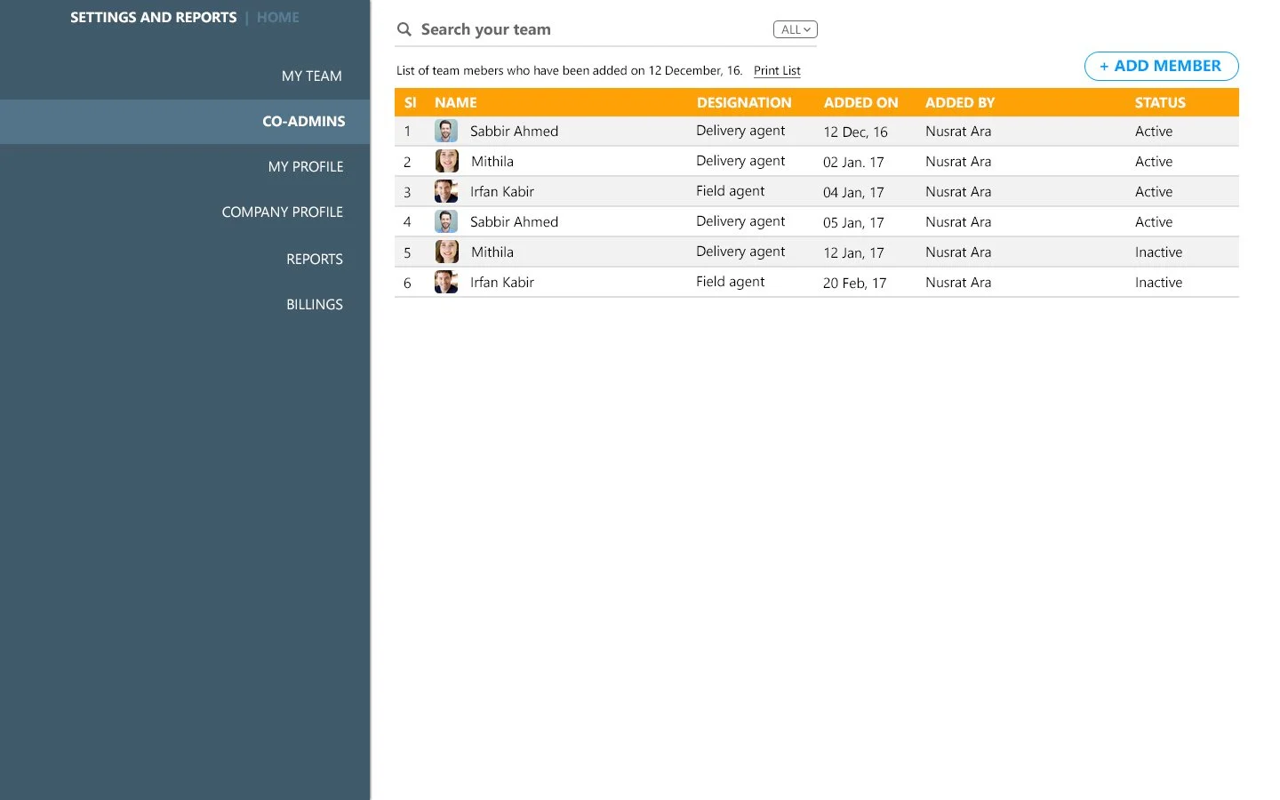
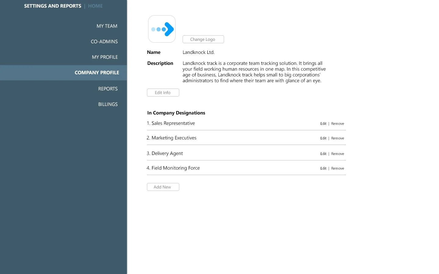
Initial Impact
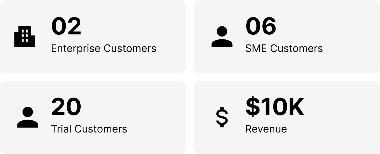
The MVP launch was a success and validated our product-market fit. Our target users became interested. They started giving us feedback, and some of them became paid subscribers. We ran numerous tests and gave multiple free trials too. I iterated the whole project 30+ times and relaunched it again and again. I, along with my team, kept getting feedback from customers and improved it. In a span of 18 months, after improving the product bit by bit this is what the result looks like
User Flow
We kept learning the user stories from all the different kinds of users; I could already relate to how the Information would be accessed within the system. I did 20+ iterations to finally come up with this final User Flow.

Sketching & Wireframes
A sneak peek at the sketching and wireframing I did to build the product that our end customers will love, finally.


Usability Testing
I presented the product to our “potential” and “interested” customers. We gave them access and did usability testing by doing close observation and note-taking. I also installed Hotjar to track heatmaps and get videos of how they use the product.

( Image from a knowledge-sharing workshop with our ICP, where I’ve shown them the app to gather early feedback. I am in the middle, wearing a white shirt )
Final Design
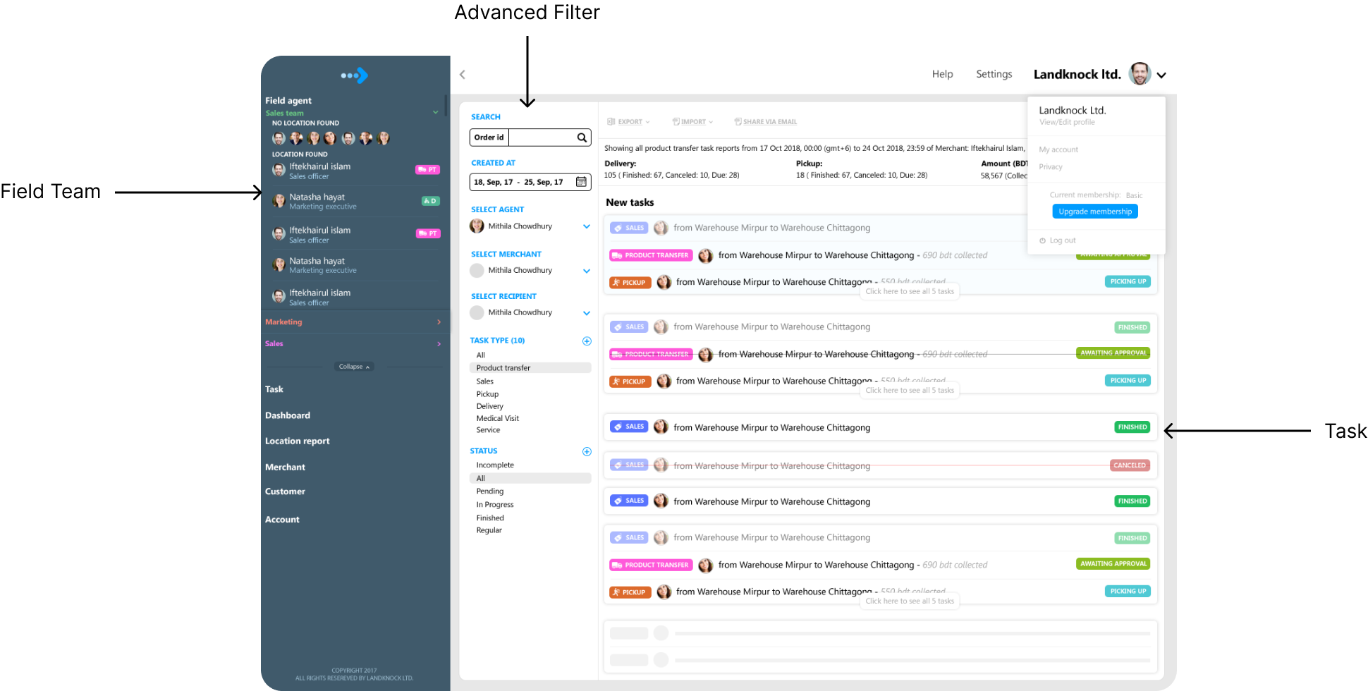
After doing 30+ iterations and improving for 12 months, we’ve found a somewhat stable solution that our customers could use with ease. Although the journey does not end here. A new beginning actually starts from this step, but that’s a different story. Let me show you what the final version looks like. There are around 100+ different screens. But I would like to show you the most important designs here:
Evolution of The Overview Page


The Map
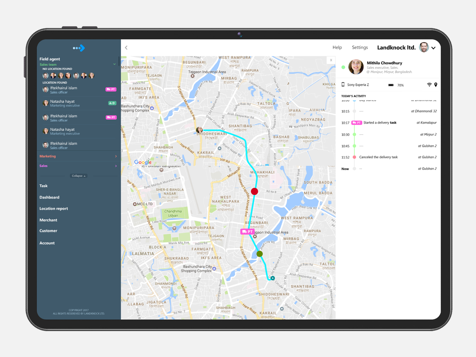
The map was one of the most important pages in the application. During the interview and the usability testing sessions, I learned what the users are looking for in the map section. After many iterations, this is what the final version looked like:

The Team/Departments
The team/department section was mostly important for super admins and department heads to manage teams within their departments.

The Task Page
I hope you already know the functions of the task page. It allows managers to assign, manage, and monitor the workflow of field activities.

The Product Page

Mobile App Screens
The mobile app was designed for field workers. I was lucky enough to have a conversation with them and also learn their side of the story.

Task Flow
The field workers had to perform different types of tasks such as sales, visits, delivery, surveys, etc. Different types of tasks involved different types of workflows. Here, I would like to show one kind of flow:

Other Screens
The app also lets field workers perform several other activities. Among those, “Add Bill” (for their travel expenses) was very crucial. Would like to show some screens for some miscellaneous activities.

Continuous growth
Once the product became mature. I’ve applied some GTM strategies to grow the user base of the app. I was not fully involved in the marketing, but as a product designer, I was involved only in those decisions that required understanding users’ psychology. For instance, I’ve worked on the marketing website and optimised it for our target users for smoother onboarding.
I’ve revamped the marketing website, optimised it for conversion, did A/B testing, created landing pages, demo pages, lead magnets, etc. I was also part of designing the email communications (not the visuals) that we had been sending to our leads.
So far:
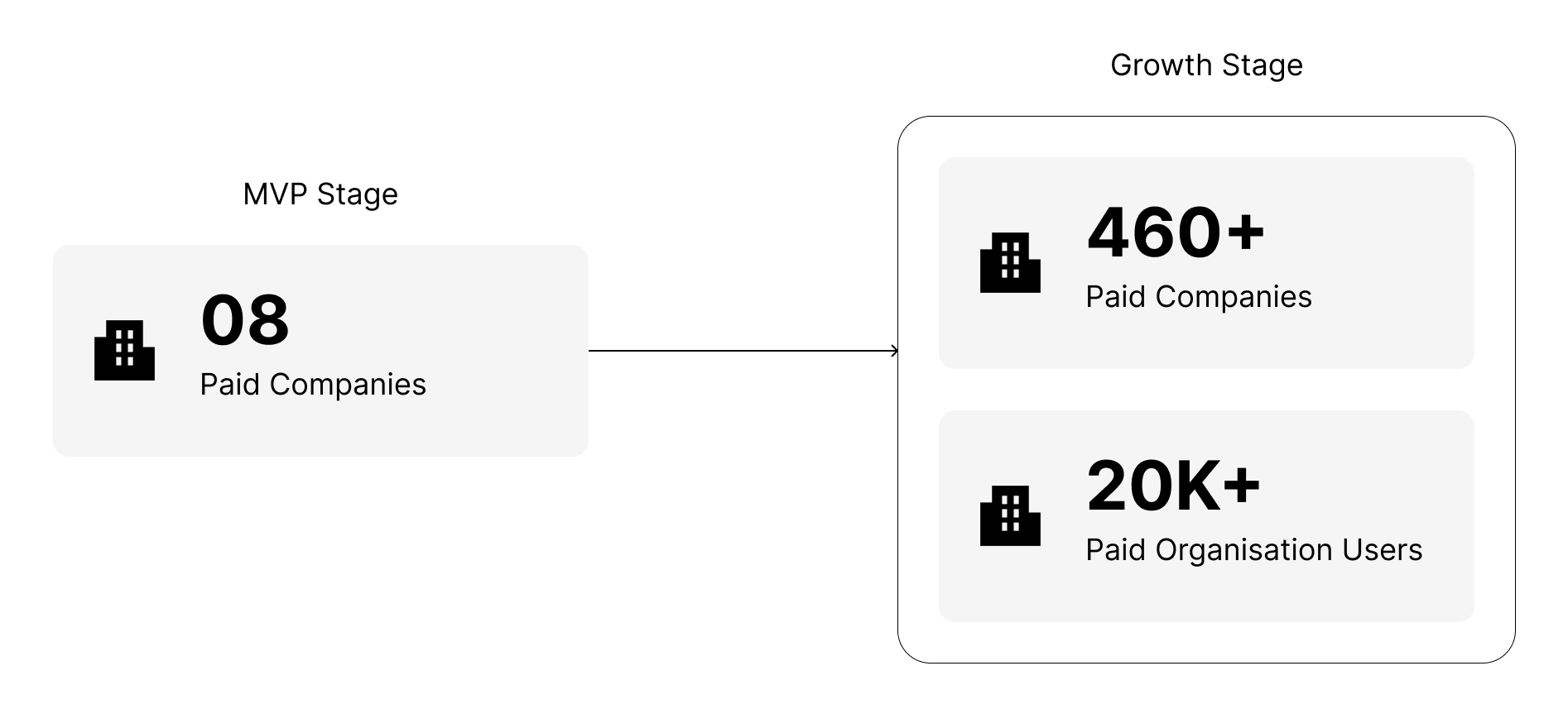
Initial growth: 0 to 8 paid companies at MVP stage (first 18 months)
Continuous growth: 8 to 460 companies onboarded with 20,000+ organisation users in the next 24 months.
Learnings
This project was very complex because this was an enterprise product. In an enterprise, there are many roles, many regulations, and of course, there are so many requirements. I had to do back-to-back meetings with different departments to get the perspective of different kinds of users. For every page of the application, I had to think about the users. However, I would like to share 3 learnings:
A B2B SAAS product designed for enterprise takes a longer time to launch than any other kind of product because new decisions may come from the management when the work is in progress. I learned to communicate with all the stakeholders to stay on our goal so that the focus does not shift in the meantime.
In Enterprise, they care more about “how much money or time” the product saves than its look. If the application’s interface is very dull-looking but it solves the problem, they are very happy.
The top-tier management people always want every option alterable. They are not easily satisfied with a simple “edit” option. They want a full “functionality” edit option, “task flow” edit options, etc. Basically, they need a lot of “freedom” within the app.
Going forward → The birth of Delimanager that impacted 2M+ end users.
While we were in our early testing phase, at one point when we had 23 companies onboarded, we noticed an interesting fact. Among those 23 paid companies, 12 were delivery companies.
That was more than 50% of our existing users at that time. This gave birth to another SaaS we called “Delimanager” or “Landknock Delivery Management System” - a delivery management SaaS built for delivery companies that impacted 2M+ end users.
You can read the full case study by clicking here.